Reagan Ray
RetailMeNot
Goals and User Research
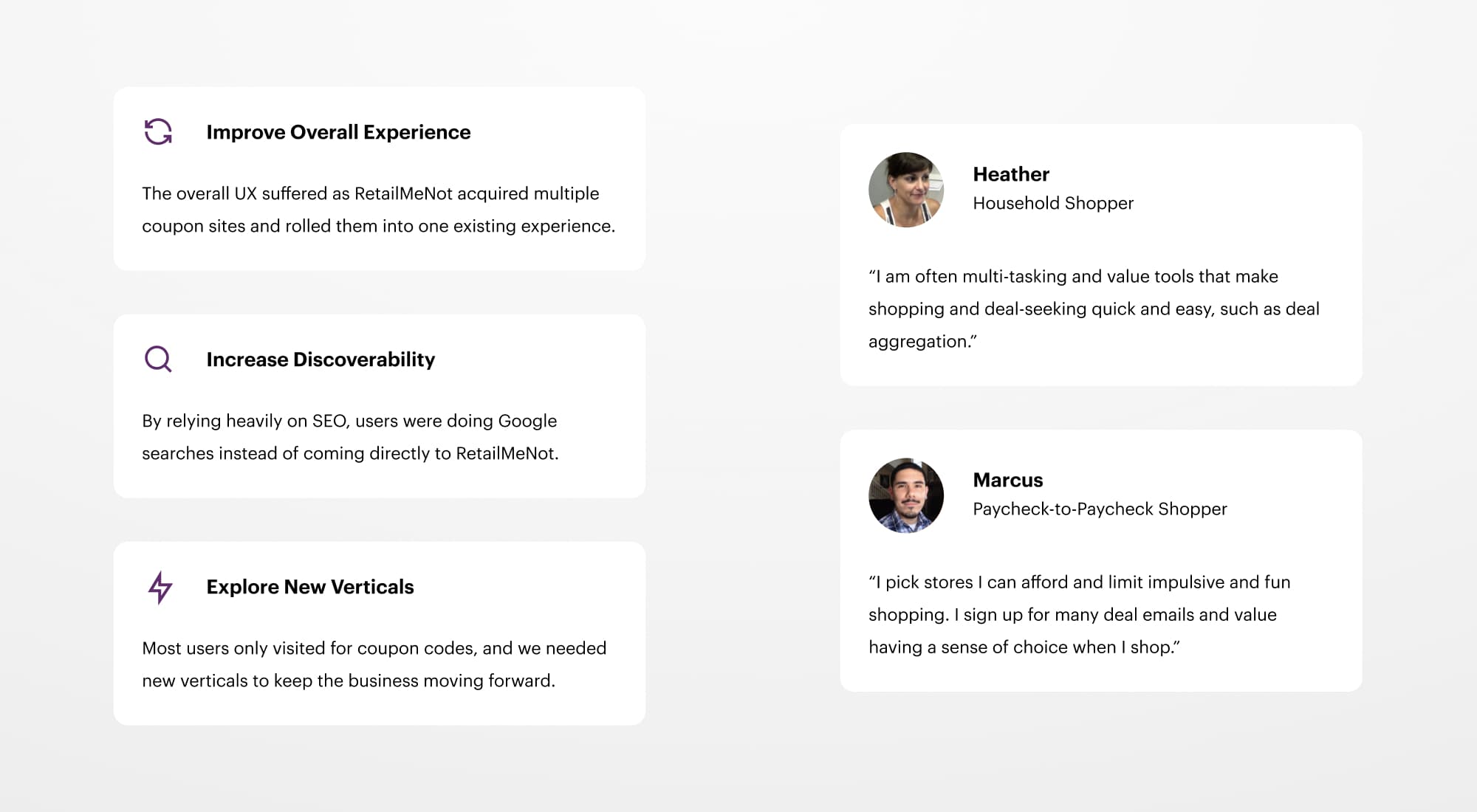
RetailMeNot was struggling with consistent user engagement outside of SEO efforts. Most users came into the site from Google looking for coupon codes, and our goals moving forward focused on increased discoverability, account sign-ups, and new ways to shop online. Working with the research team, we developed user personas and conducted interviews to establish a path forward.
New Branding and Creating a Design System
I started by re-setting and updating the brand guidelines for the site to be more consistent and mobile-friendly. After consolidating multiple shades of purple and moving from beige to white as the base color, I worked with the very talented Jessica Hische on a refreshed logo (which took much convincing directly with the CEO to adopt - the old one was his baby).
Jessica has a wonderful writeup of the logo refresh process on her site.
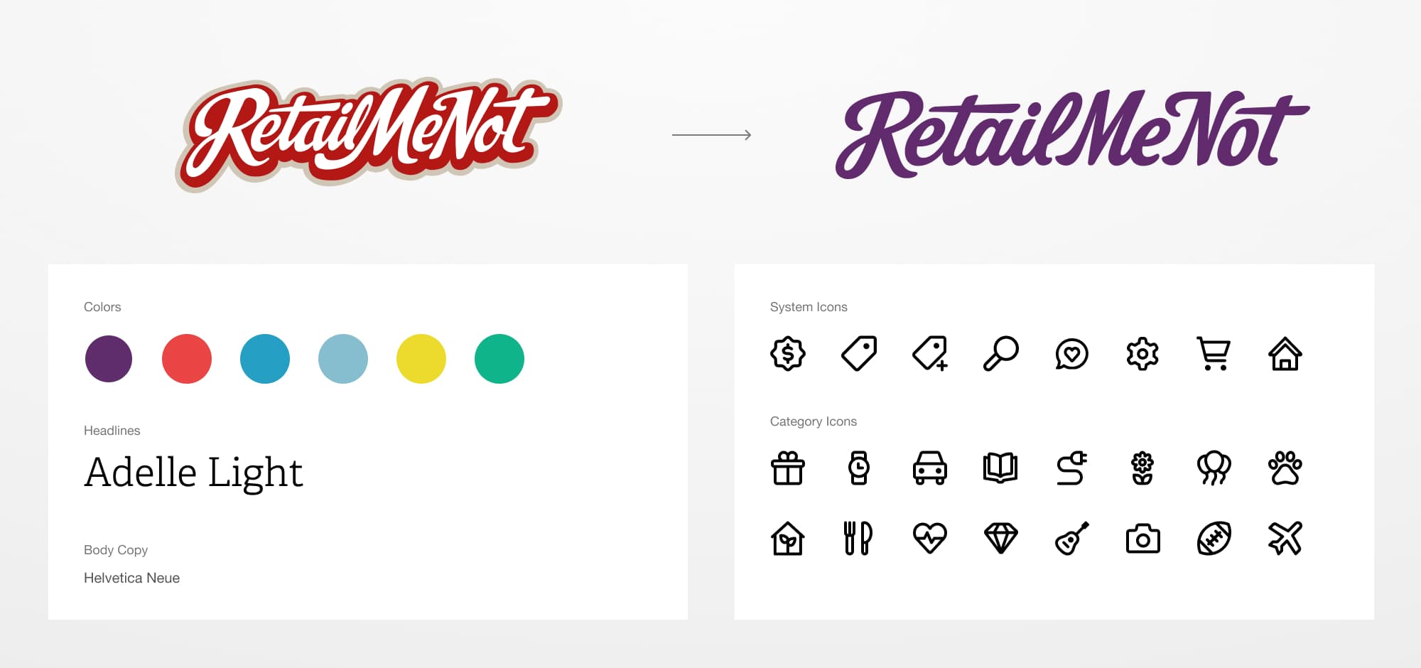
The new styles, along with a redesigned logo and new icon suite
With new brand standards in place, I helped form the inaugural design system team at RetailMeNot, consisting of design, engineering, research, and marketing. The first phase consisted of a component inventory, aiming to consolidate all disparate patterns into single, reusable components that all teams could adopt.
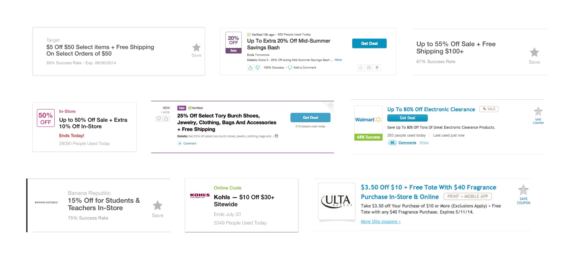
An initial inventory of the coupon found over 25 unique implementations
We worked under the leadership of the VP of Product and were able to put together an MVP in under three months. Our design system work was ongoing, and together, we created a new set of buttons, a universal coupon component with multiple variants that we could use across the entire site, and additional form and social components.
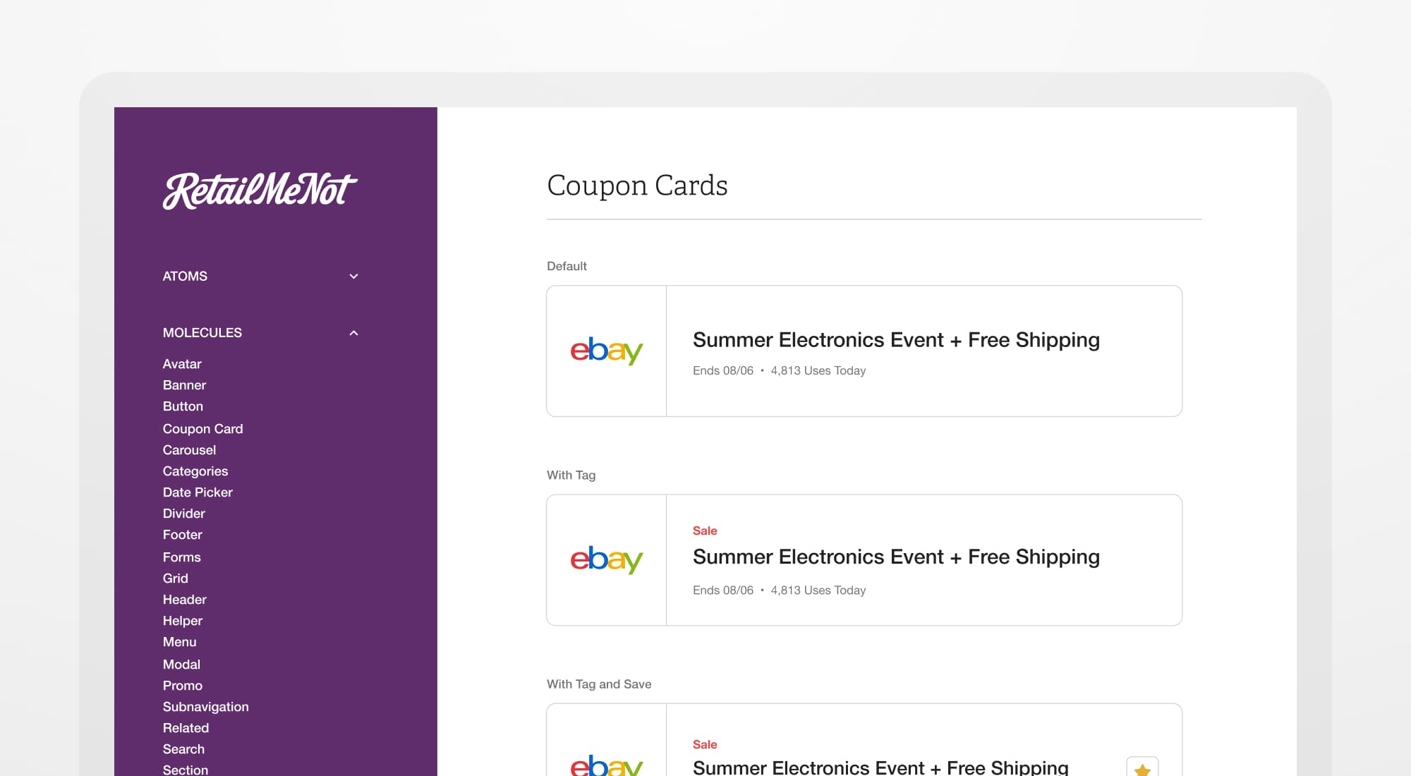
The new design system site displaying different properties of the coupon component
Repositioning for Increased Discoverability
The existing version of the RetailMeNot homepage was cluttered, unfocused, and all over the map stylistically. At the time, most of their traffic was through SEO, and the homepage experience was a bit of an afterthought. The goal was to get users to visit retailmenot.com directly rather than finding what they needed through a Google search.
I first went to work creating a new coupon component with a more explicit hierarchy - putting greater emphasis on the deal headline, store logo, and CTA. I designed a new hero unit that introduced lifestyle images and featured a horizontal scroll that showed more deals. I also introduced new marketing tiers to help promote account creation and app downloads.
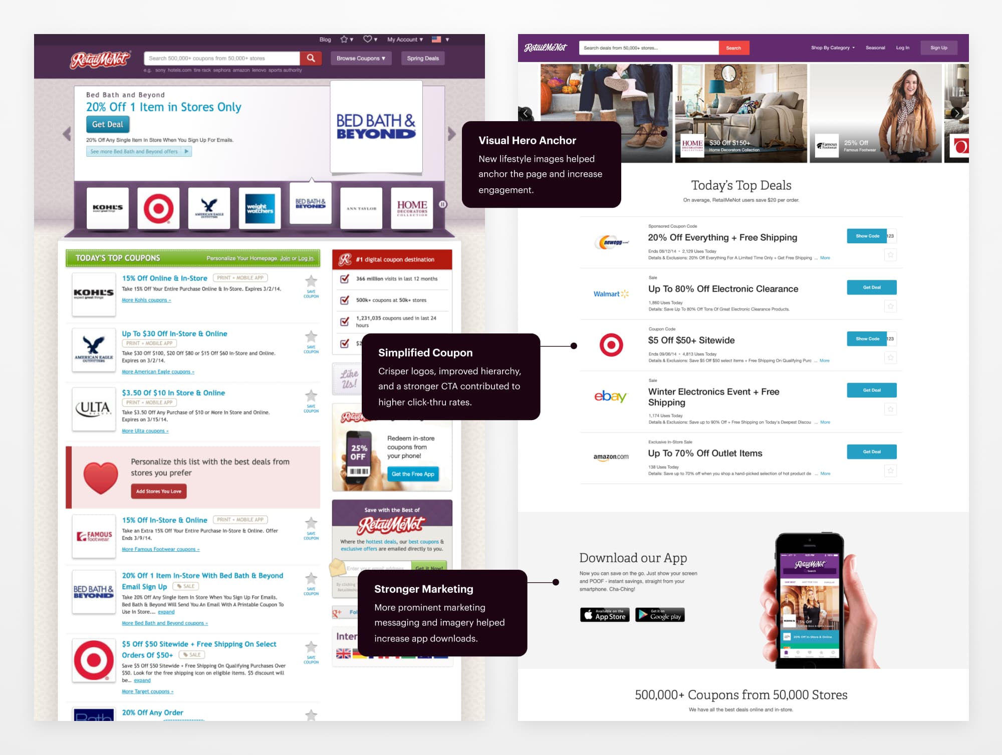
Before and after the homepage redesign
Identifying Opportunities in Personalization
Through the new design work on the homepage, I started to identify opportunities for creating a more personalized experience across RetailMeNot. I designed a new, streamlined navigation that eliminated a lot of unnecessary noise and emphasized account creation. Sign-ups increased by over 24% with the new UX.
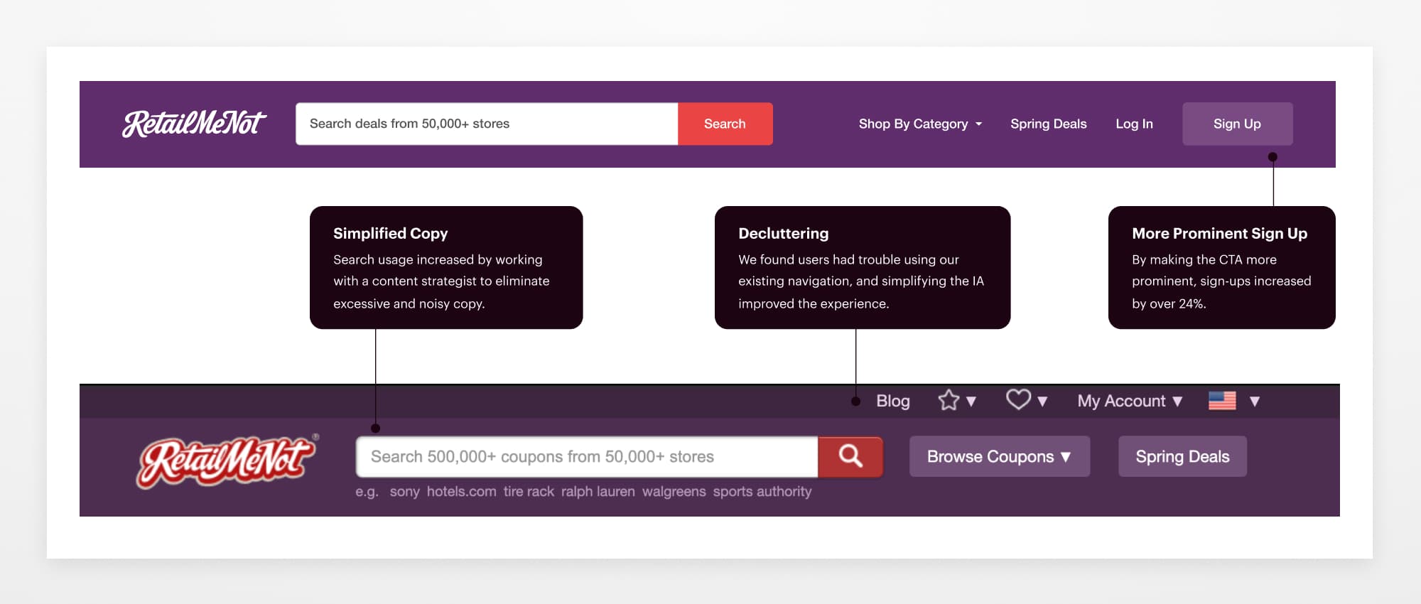
An updated and simplified navigation with an emphasis on sign-ups
I updated the onboarding flow to drive brand loyalty and provide users with a more personalized experience. Designing and testing a flow where users could add their favorite stores allowed us to present the user with a more personalized and relevant homepage experience. It also introduced them to their account, which allowed them to personalize their experience on RetailMeNot even further.
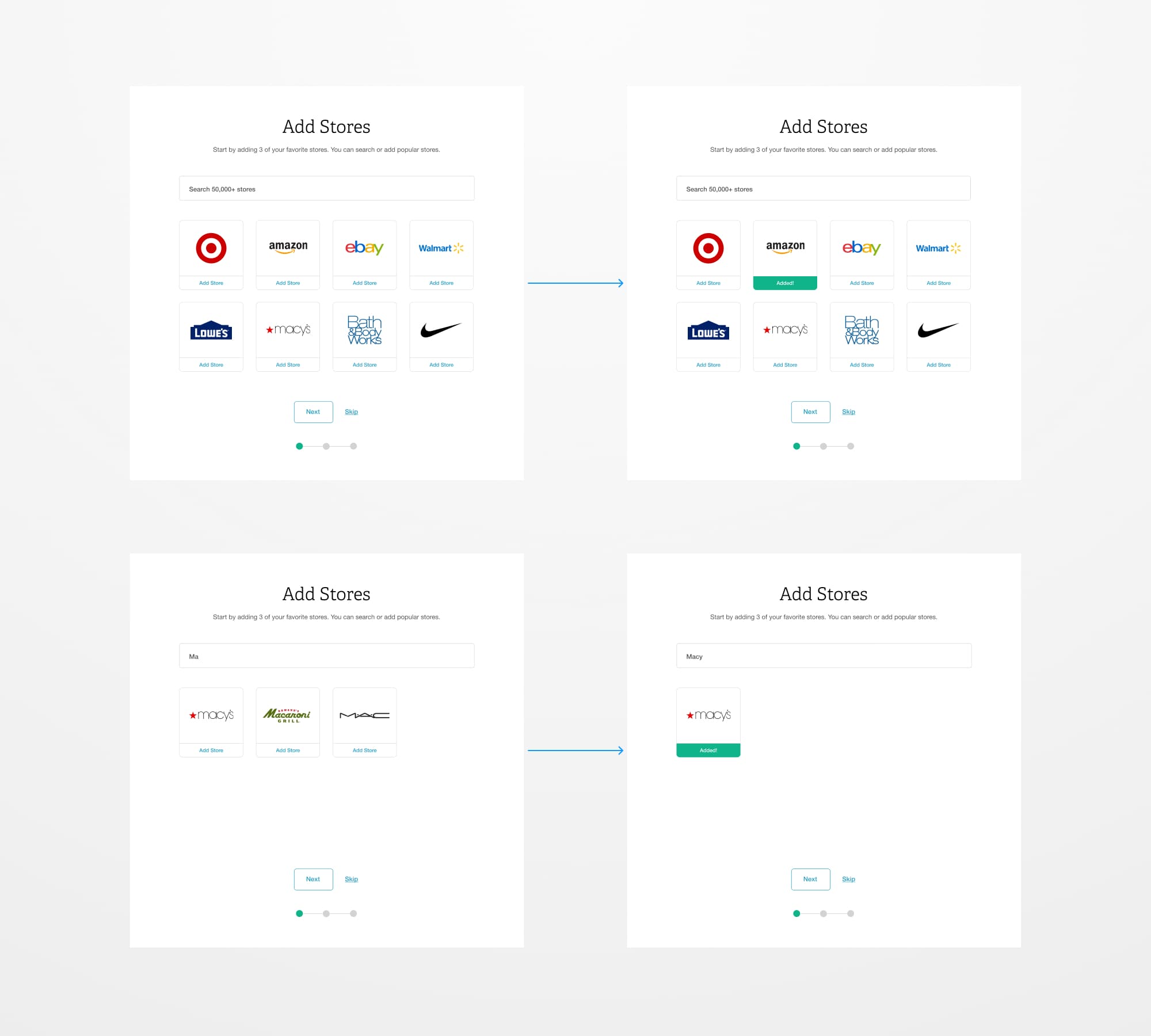
Testing new onboarding ideas for searching and adding your favorite stores
After establishing favorited stores through onboarding, we also tested and launched a new favoriting system for coupons and deals. Users could interact and see their saved coupons and deals in their account or on the app, and we notified them when deals were getting ready to expire.
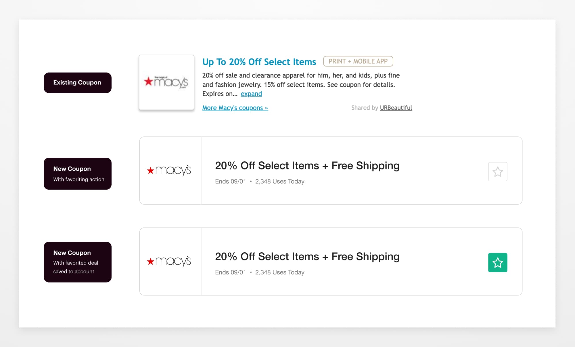
Adding a new favoriting pattern to our coupon component, with the existing coupon on top
Prototyping New Experiences
With a design system and user testing practice in place, we could rapidly prototype and iterate on new experiences and get them in front of users for their feedback. The process was highly collaborative and usually started with brainstorming and a few sketches. We introduced new ways to shop by bringing product savings into the mix, namely the ability to find the lowest price for an item. It kept much more traffic on the RetailMeNot site, driving improved conversion rates.
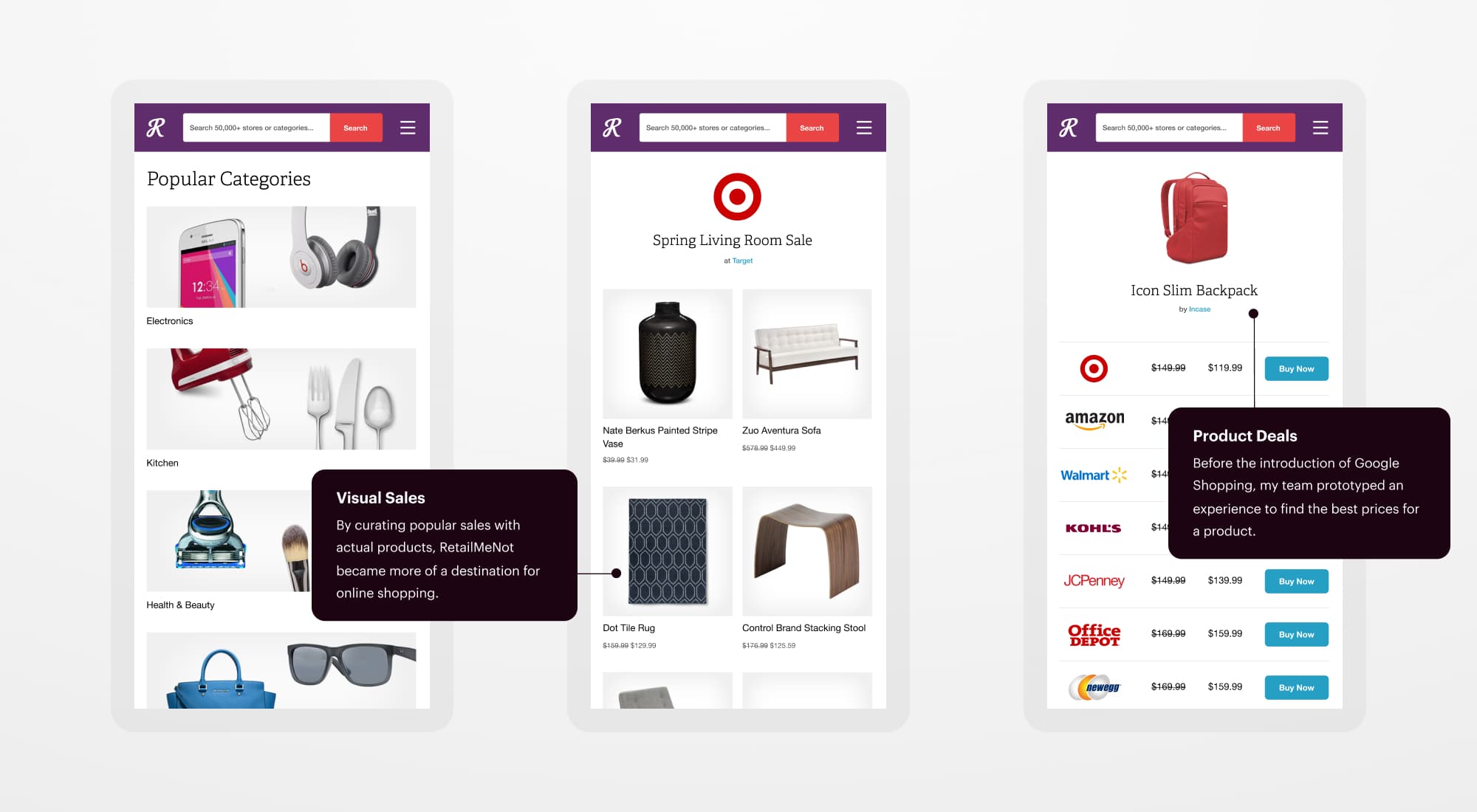
New verticals we prototyped with our design system
App Redesign
My last project with RetailMeNot in 2015 was taking our design system learnings and translating them into the app experience. The existing app had some snappy animations but was essentially a long list of coupons. We created more visual interest and hierarchy, a revamped account dashboard, and a horizontal scroll component to feature more deals. I'm happy to say that the UX is still in use today.
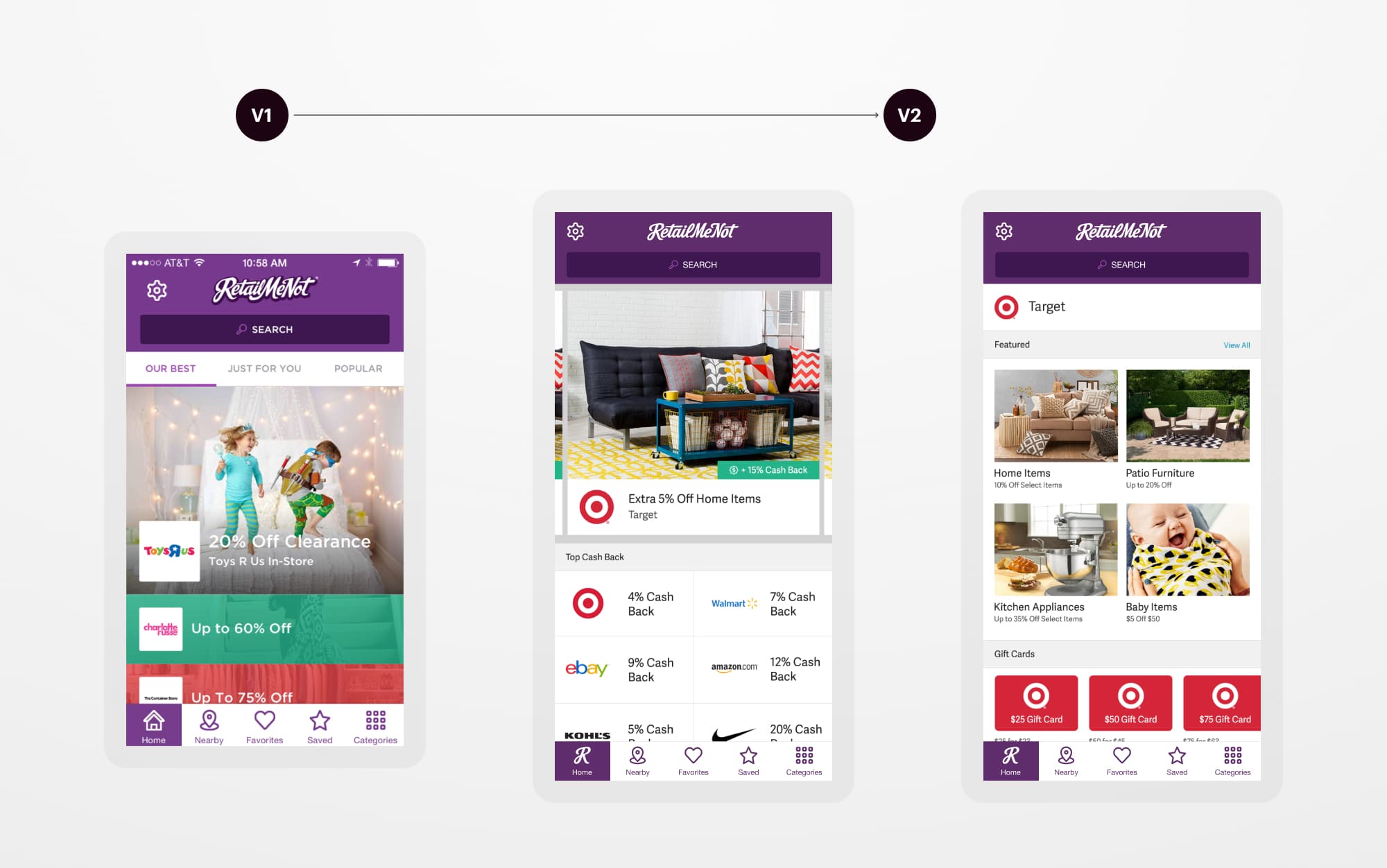
New screens for the RetailMeNot iOS app
Next Up