Reagan Ray
Microsoft
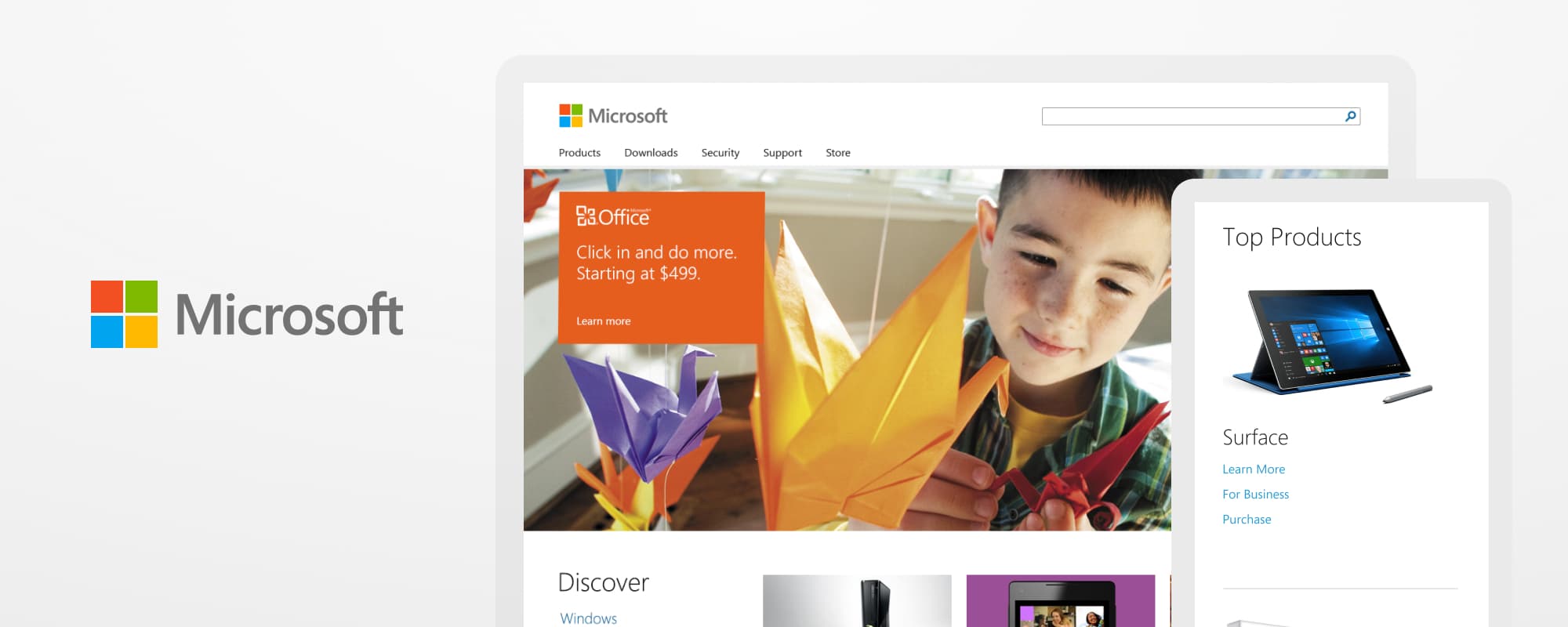
A New, Responsive Homepage
In 2012, Microsoft created a new visual design language called Metro that centered around the launch of Windows 8. It was an exciting time - the new look was well received, and Microsoft was receiving positive press around the Microsoft Surface and Windows Phone. It was the perfect opportunity to update their web presence to a more modern look.
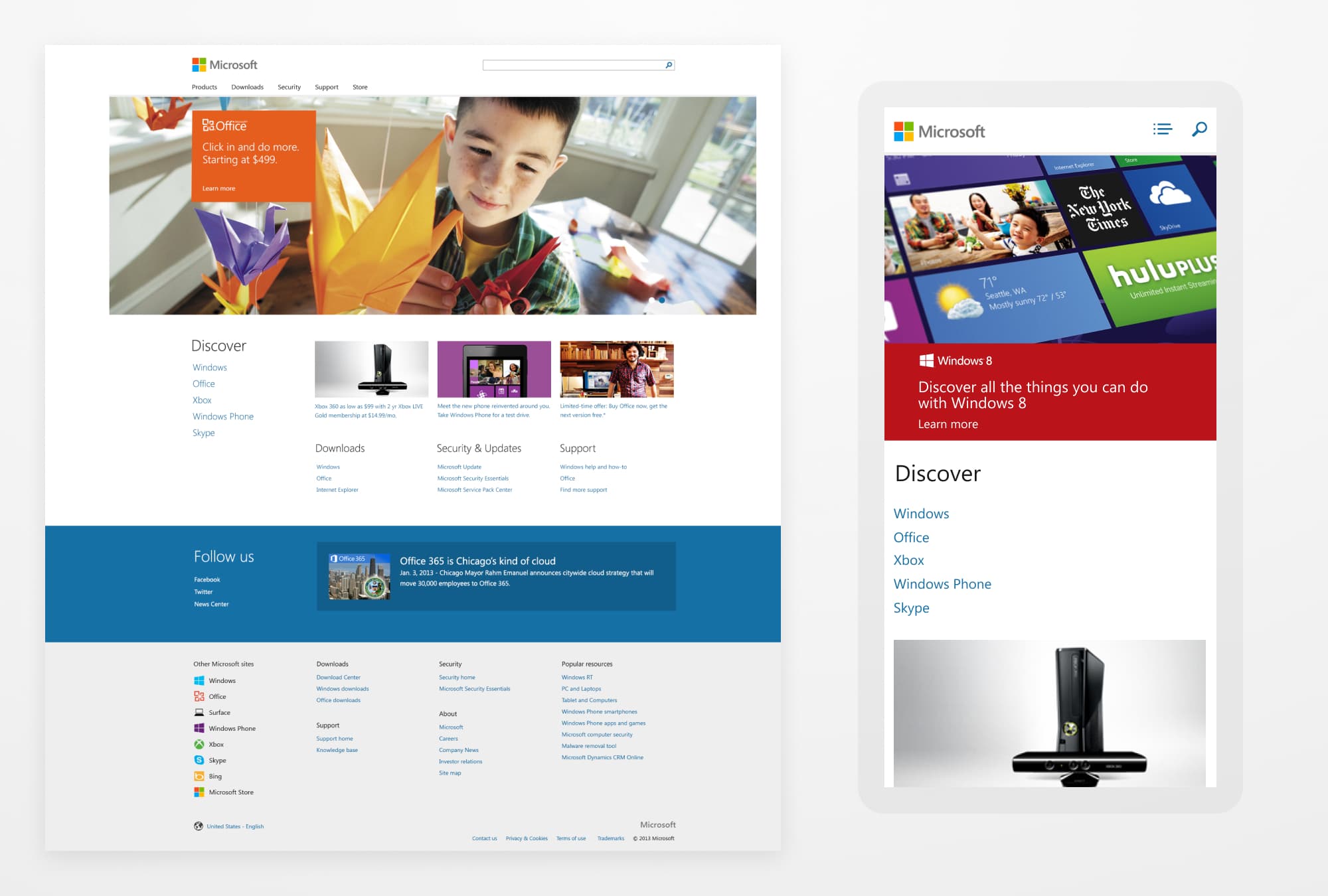
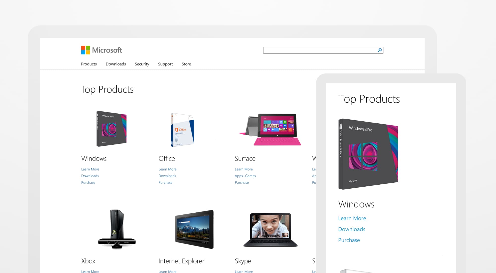
The new, responsive homepage design
I was brought in with my colleagues at Paravel to partner with the MSCOM team in designing and prototyping how type, grids, rotators, video, and navigation work best in a responsive setting. As the 17th version of the Microsoft homepage, coupled with positive press around recent launches, our team had an abundance of business goals to consider for the new look.
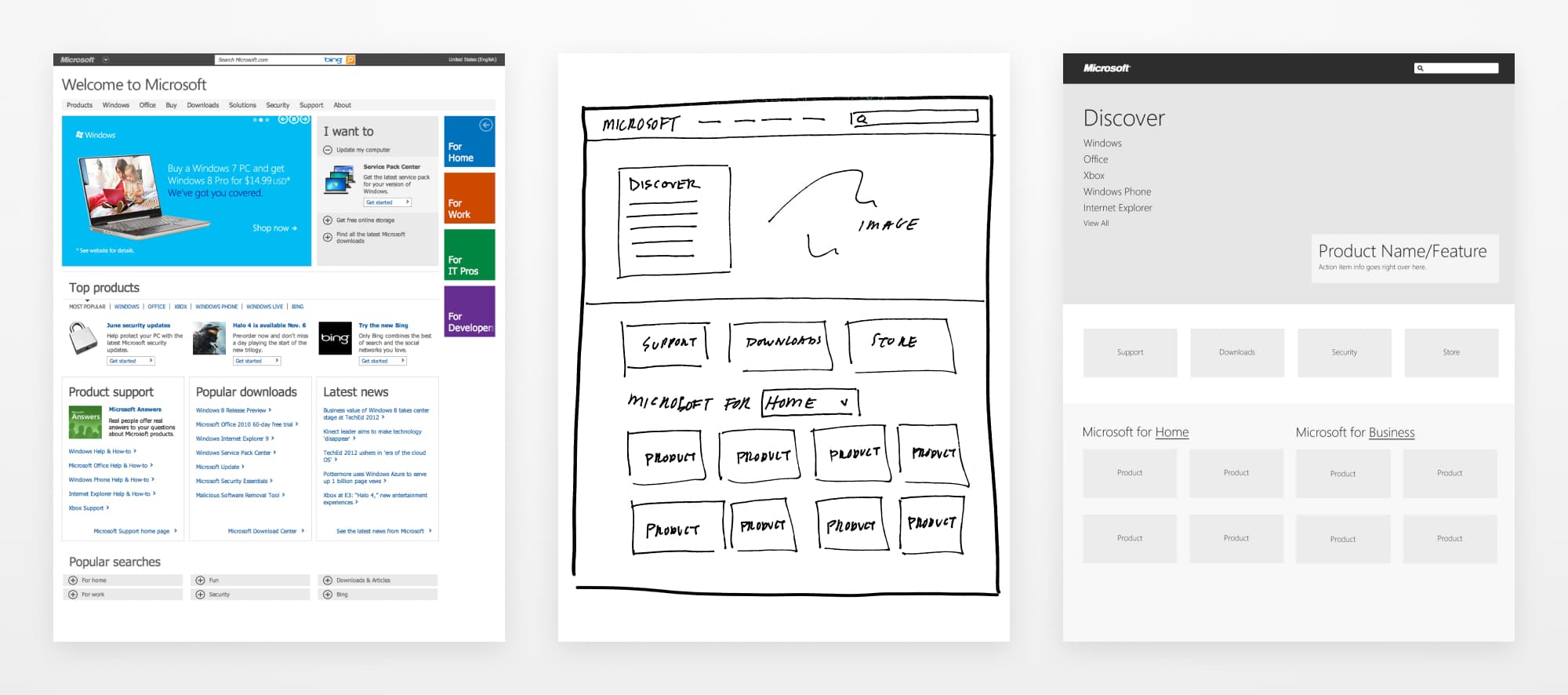
The design process, from the old site to sketches to wireframes
We were happy to receive an outstanding amount of positive press around the launch, including write-ups in Forbes, The Next Web, and The Verge.
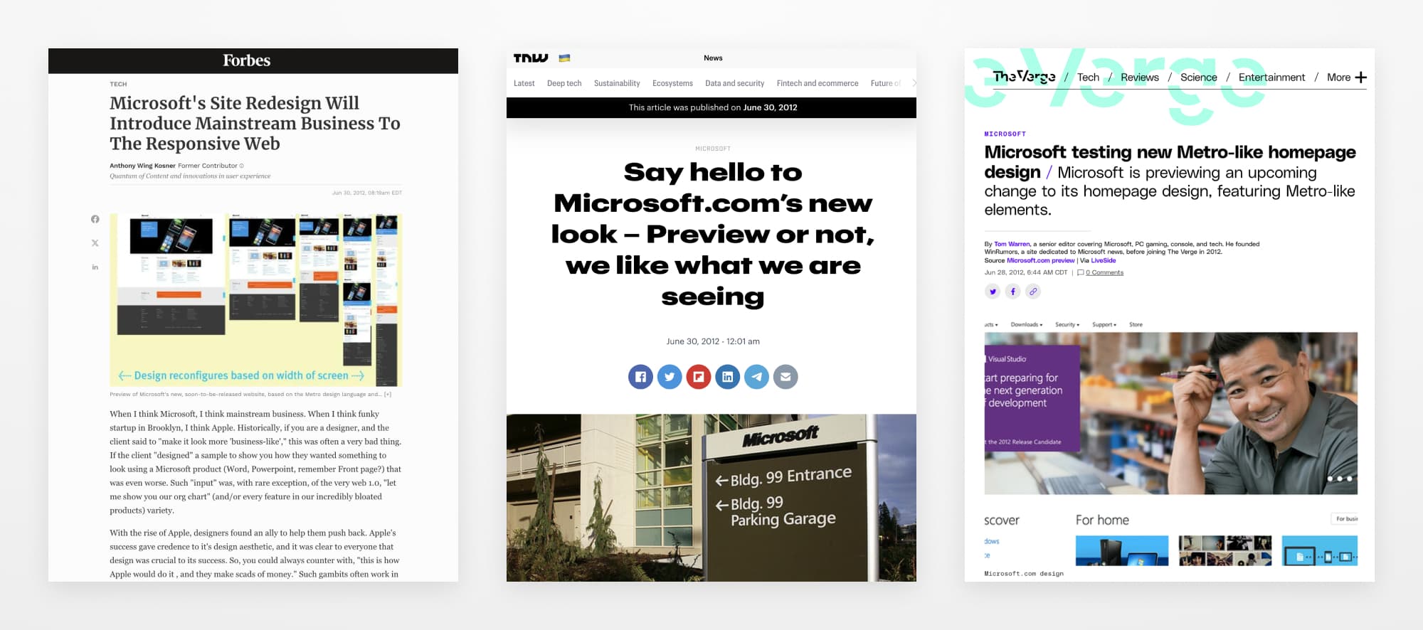
Some of the praise we received for the new design
A Design System Based on Windows 8
In 2015, I began working with the MSCOM team in a full-time capacity to create a design system based on the new homepage. The brand team at Microsoft had made many advancements in type, color, and iconography that they were eager to use throughout all of Microsoft's properties.
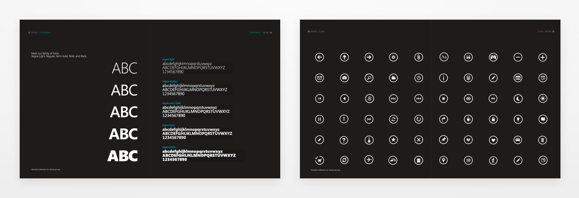
A sample of the updated Metro brand guidelines
I started working with the engineering team on the initial version of the MSCOM design system, initially called Picchu and later MWF (Microsoft Web Framework). We designed and coded an initial set of components and wrote usage and implementation guidelines.
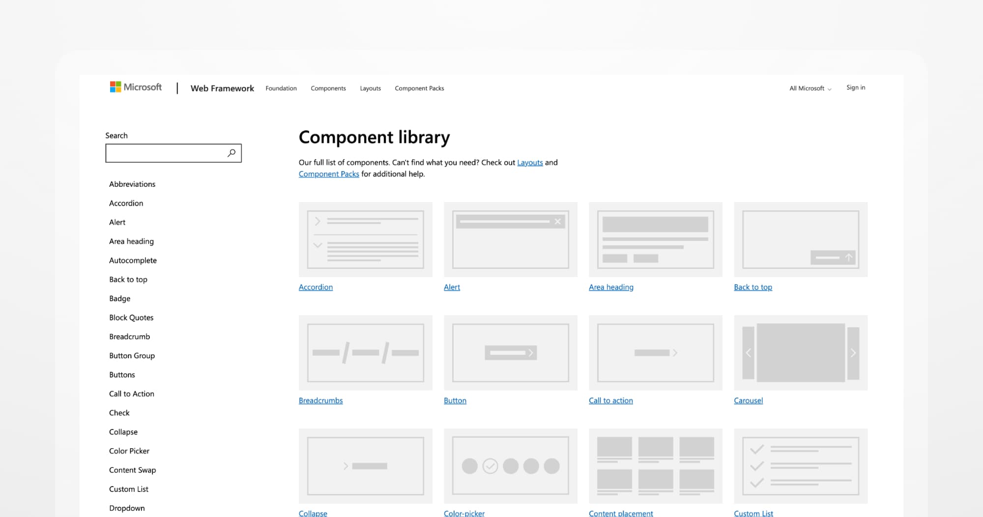
The initial documentation site for our first design system
One of our biggest challenges was creating a universal header and footer, which we called UHF. Each property in the Microsoft ecosystem functioned as its own entity, and there were many adjustments and requests based on internal business goals. We saw traction as some of the larger properties adopted UHF, and it eventually became the standard.
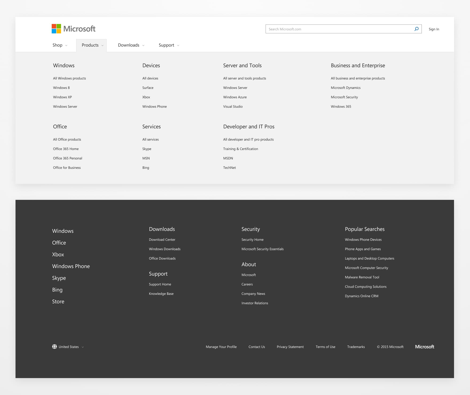
The first version of a universal header and footer system
Expanding the Design System Beyond the Homepage
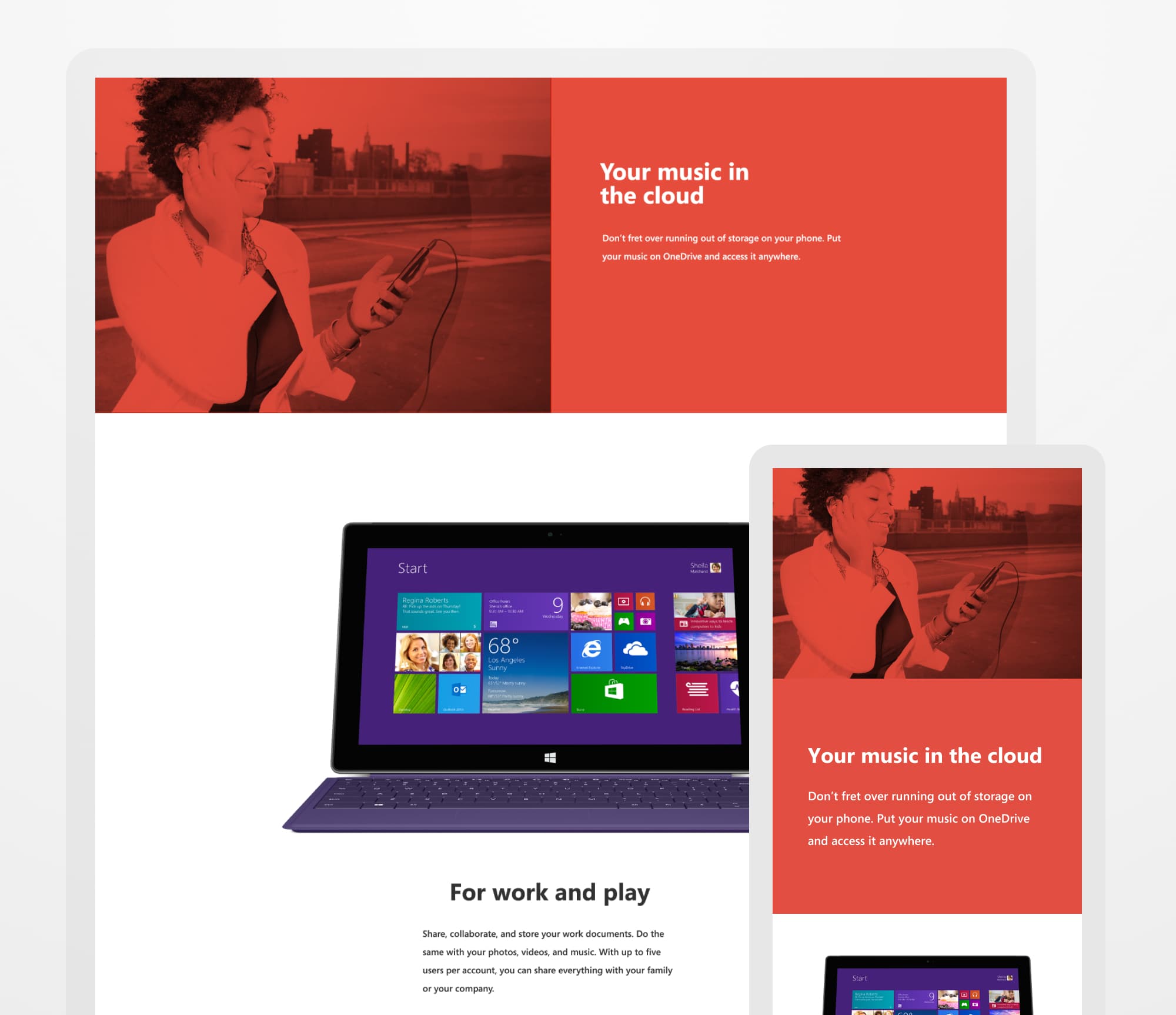
With a good grasp of the new visual design and a set of proven, reusable components, we worked with multiple teams to implement the new experience. We worked with the store team to launch a product experience that brought all of Microsoft's offerings onto one page for the first time. We also created a set of marketing-oriented components for a new Microsoft Surface and Windows Phone app page.
An updated landing page for the Microsoft store
A new app page for Microsoft Surface and Windows Phone
Design System Work for Other Microsoft Properties
Our MSCOM team functioned like an agency in the Microsoft ecosystem. Other groups within Microsoft contracted us to help drive new re-designs using the design system we built. It was a unique range of work and featured a few different implementations. Channel 9's experience was more immersive, as they wanted the look of a streaming service like HBO. Microsoft Research needed to align with other academic research sites, emphasizing search and discovery. Windows Insider was optimized for tablets, as most of their content focused on beta launches for the Microsoft Surface.
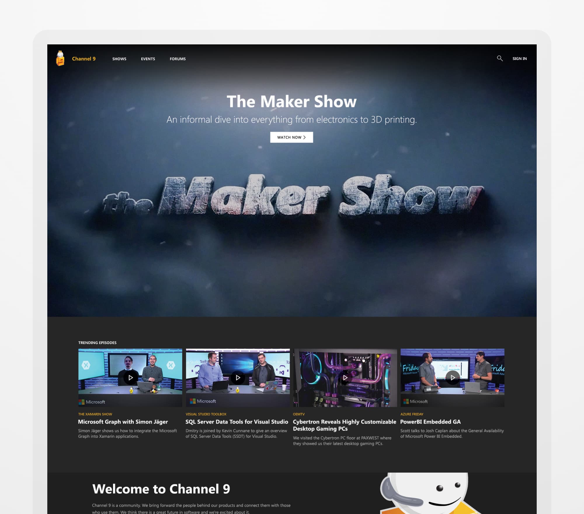
A new immersive experience for Channel 9
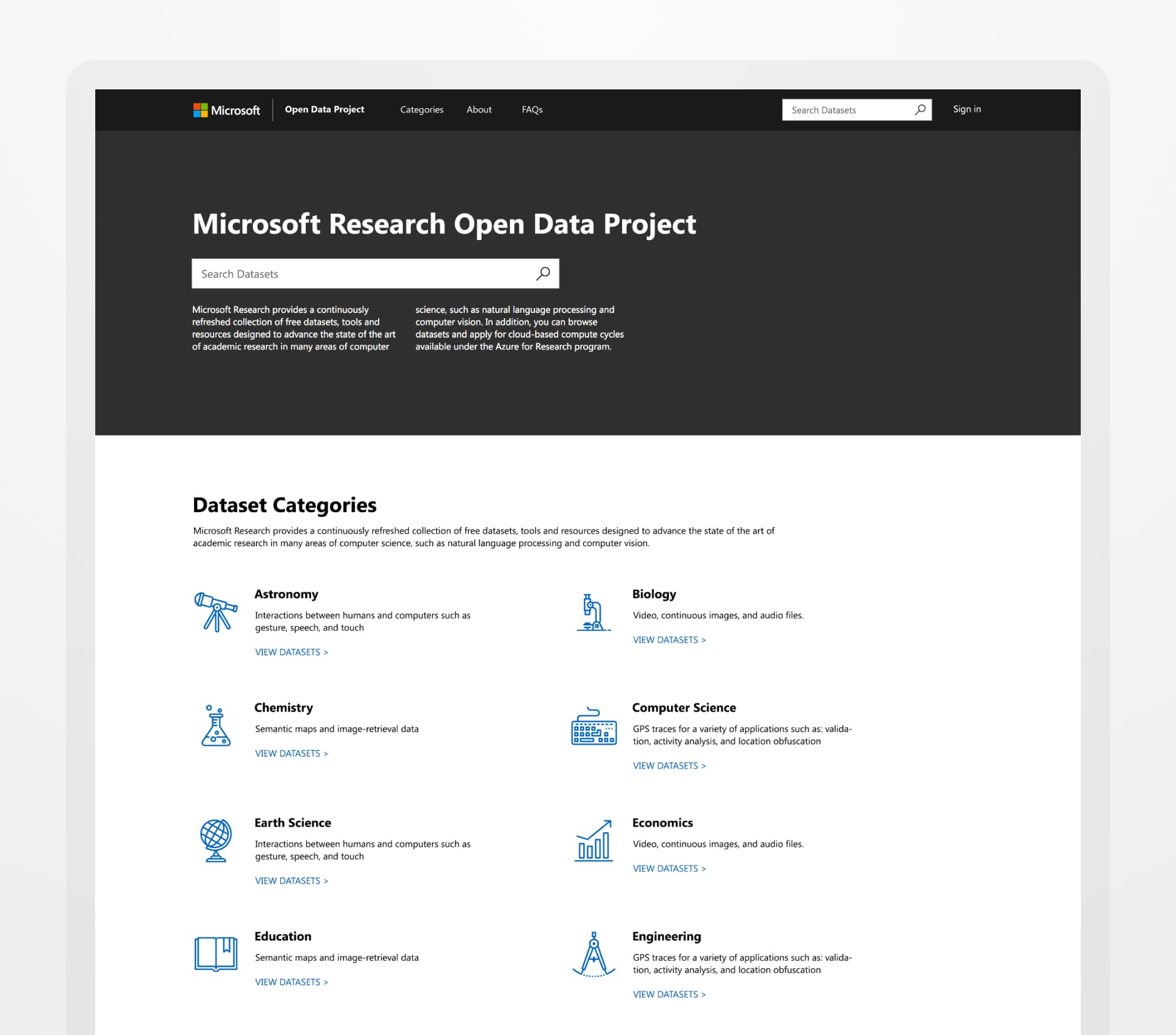
A more academic-influenced implementation for Microsoft Research
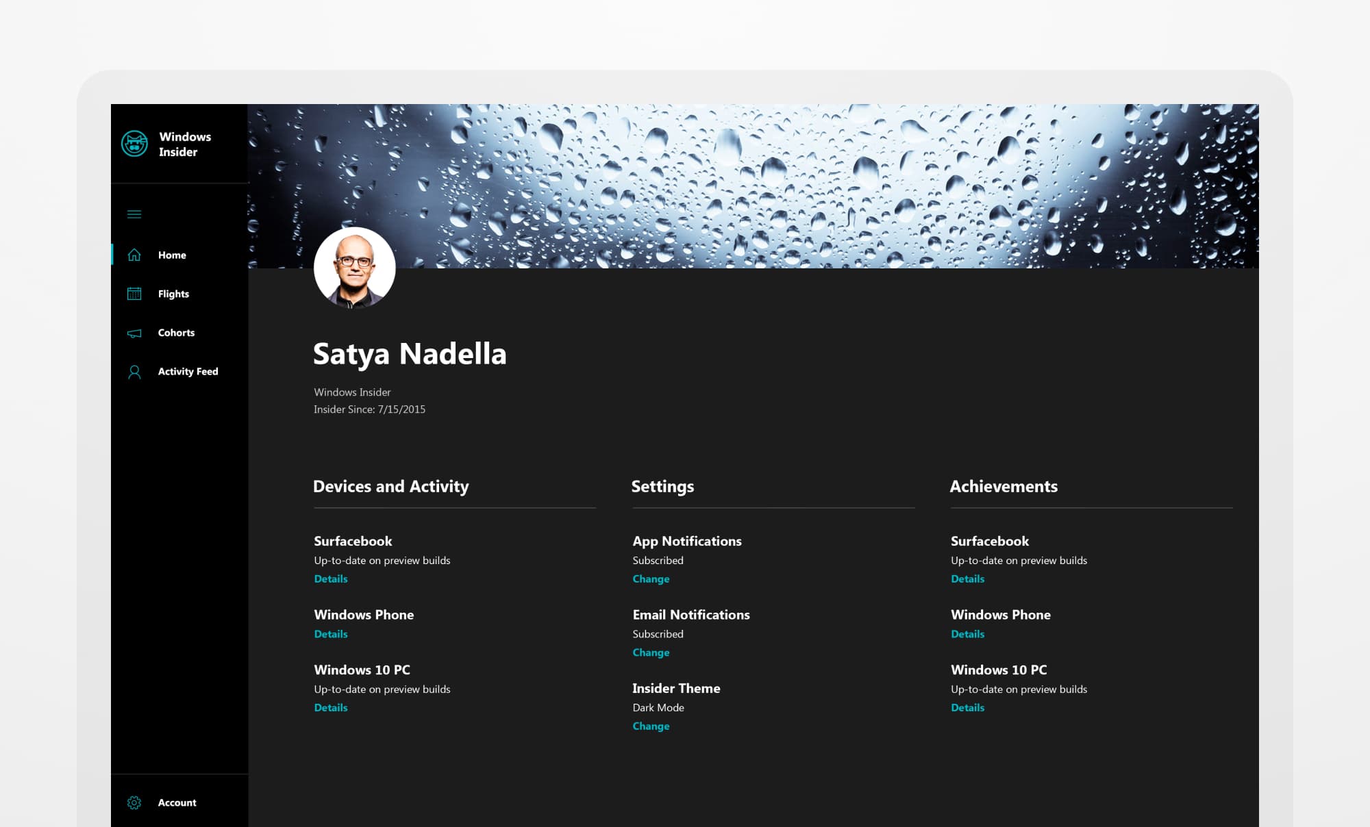
A tablet-focused look for the Windows Insider program
Launching the First Build Conference
One of my favorite projects at Microsoft was the launch of the first Build Conference. I designed the branding for the conference, including the color scheme, website, environmental signage, name tags, etc. My team also worked with Channel 9 to create the in-conference experience, with a scheduling tool and live streams of each talk.
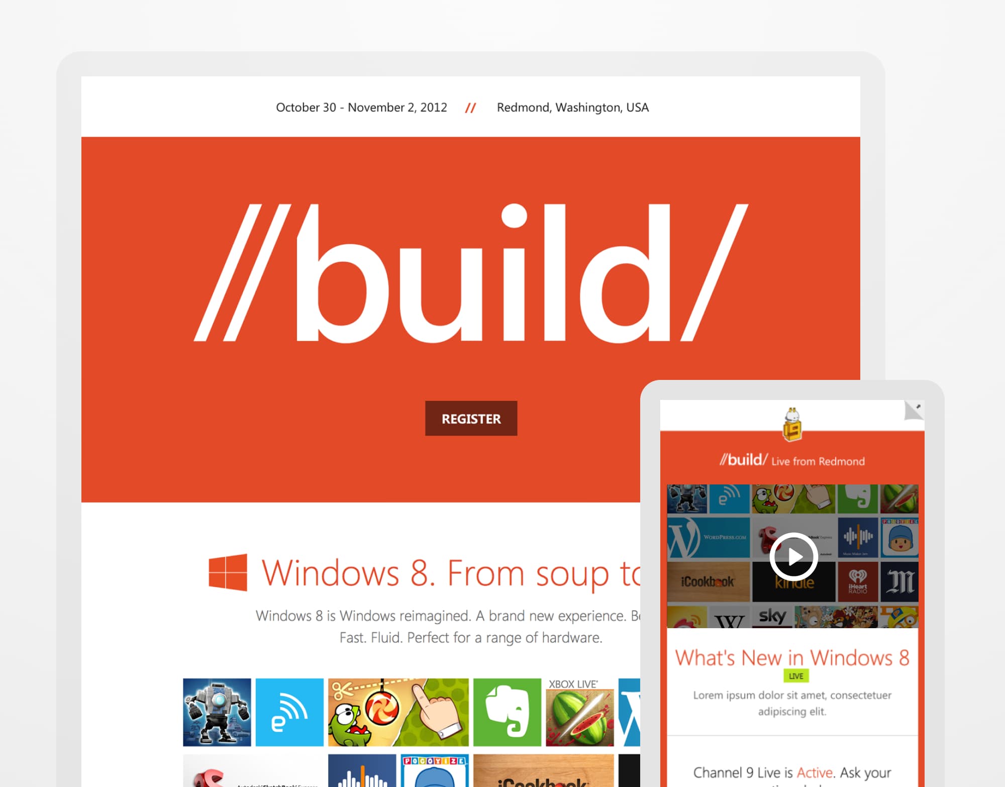
Web presence for the very first Build conference
Next Up