Reagan Ray
Papa John’s
Goals
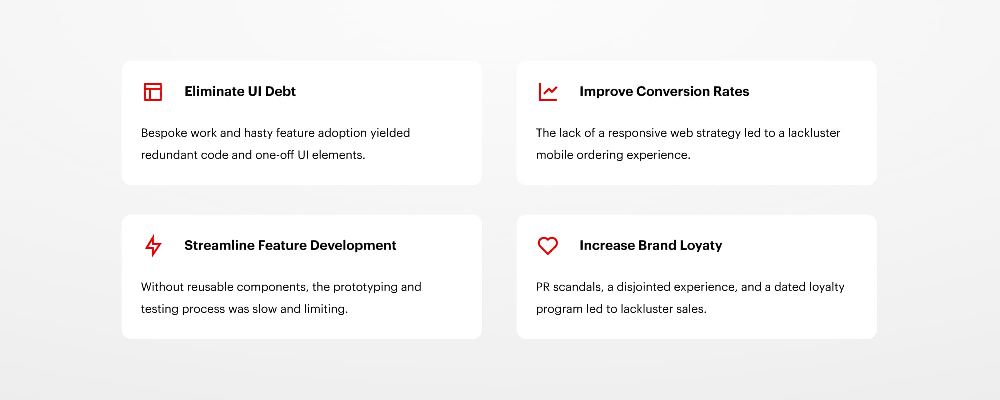
When I started at Papa John’s, the design team struggled with a disjointed product development process, an inconsistent user experience, and a dated brand. As lead designer, my initial goals were to establish a responsive digital strategy, build the initial front-end design system, and streamline the feature development process.
Building a Design System from Scratch
The overall user experience when I started at Papa John's was disjointed and inconsistent. Multiple agencies and contractors had hastily shipped features, resulting in redundant code and one-off UI elements. Before beginning any redesign work, I conducted a component inventory to highlight items that could be combined or removed. I found 27 versions of the button alone.
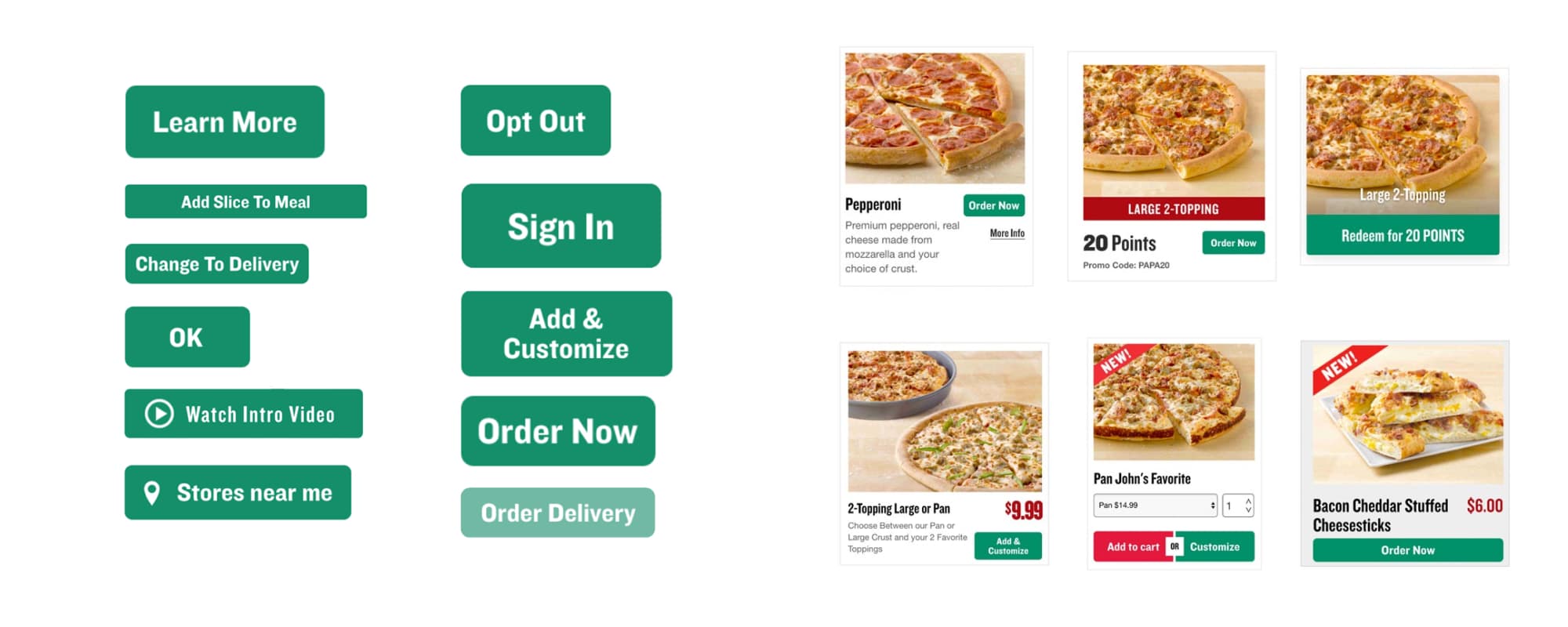
Conducting a component inventory of the entire site
Working with engineering, we built the whole website with ~25 components, which allowed us to reduce the CSS by ~900kb, leaving the page weight at 22% of its original size. By building reusable components in HTML and CSS, we were also able to speed up the prototyping process and improve handoffs with our offshore team.
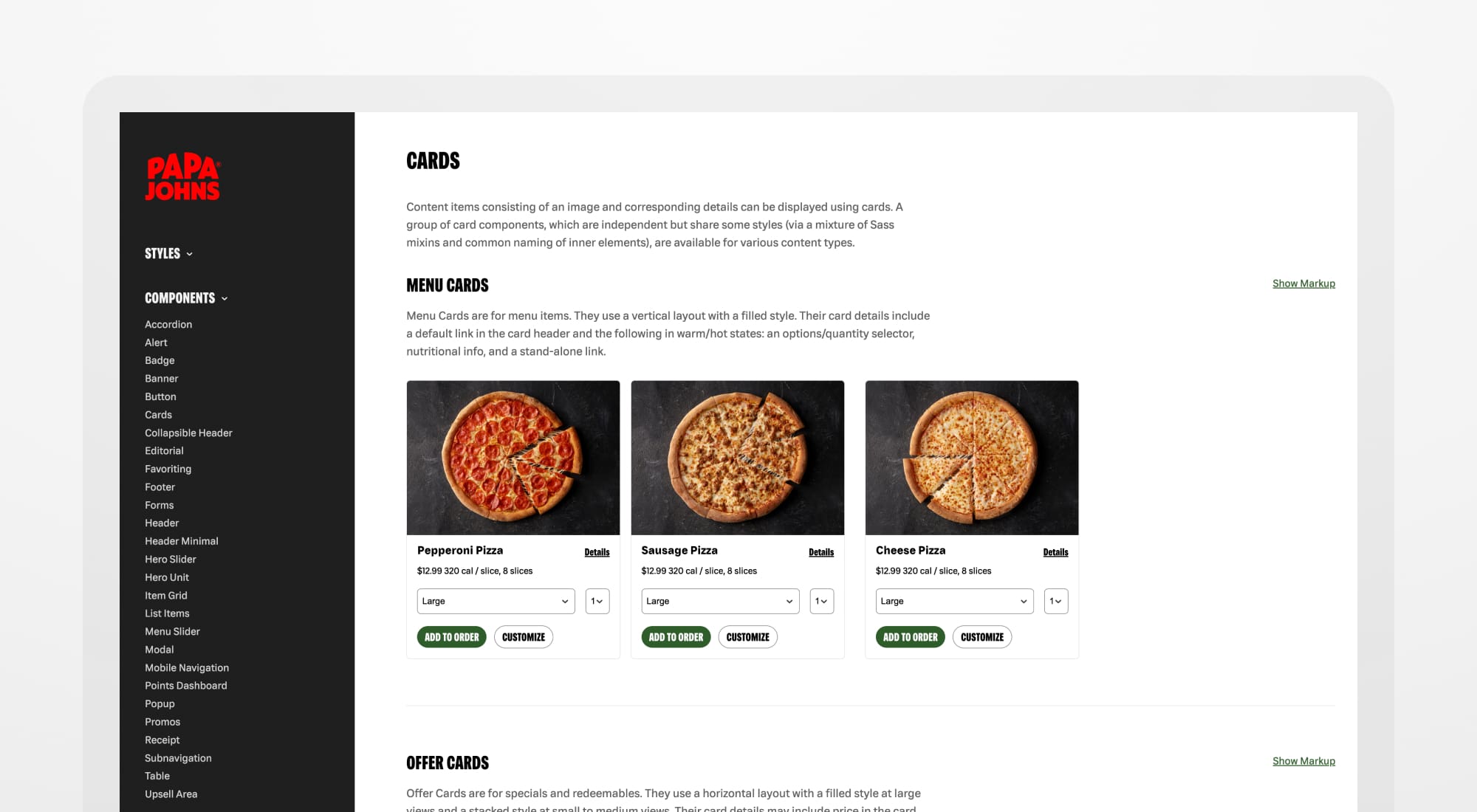
I iterated the most on our menu card component, implemented across multiple touchpoints.
The entire design system was state-based, meaning each component had different actions based on the user state. For instance, the menu card did not show prices if a user had not set their local store. The design system became a hub for the entire organization, used cross-functionally by leadership, design, engineering, and product.
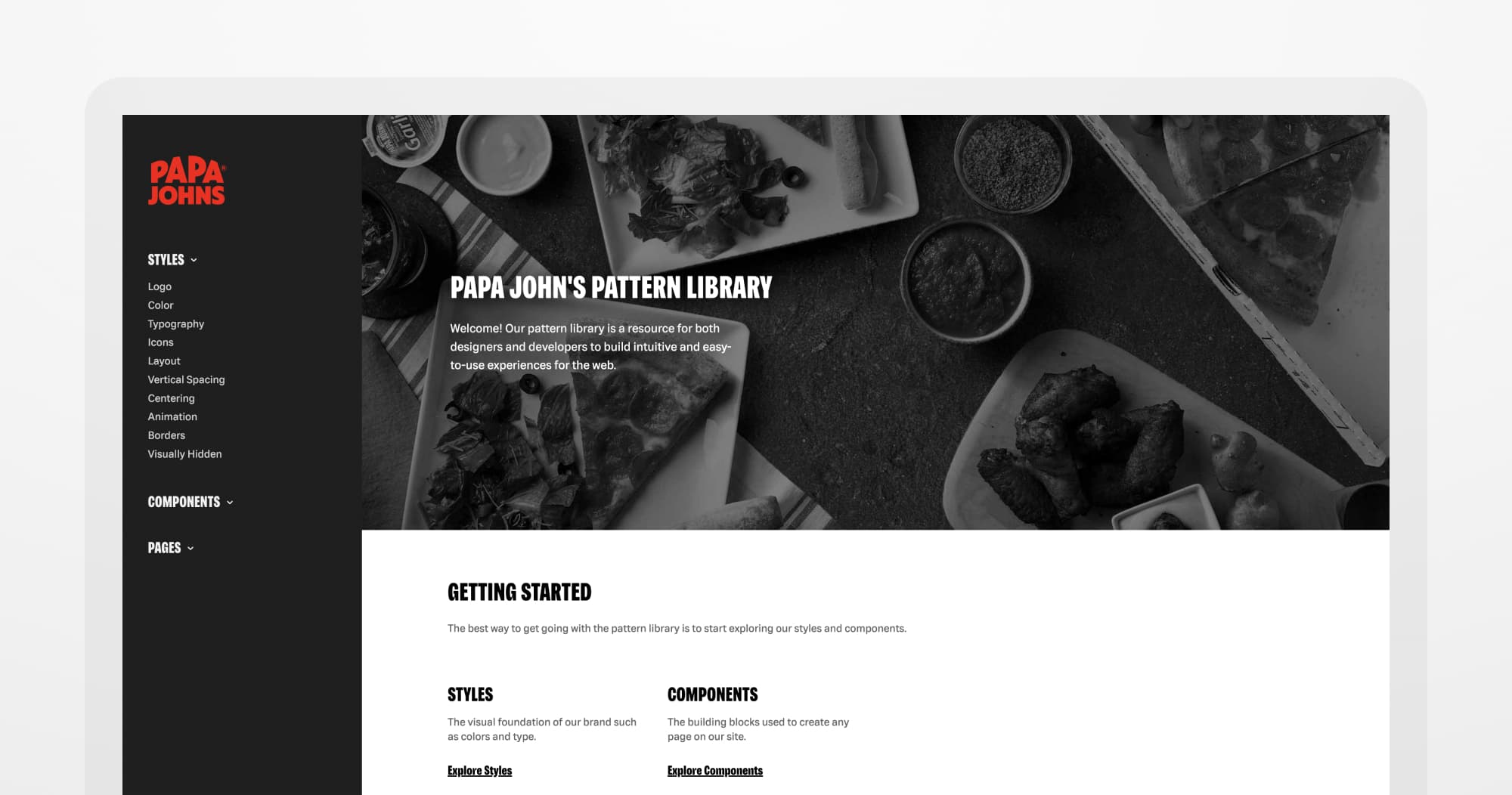
The landing page for the newly built design system at Papa John's
As UX Director, I led the digital implementation of the first significant re-brand in company history. The new look included an updated color scheme, logo, and a custom font family called “Papa Sans.” Our established design system helped guide the successful implementation.
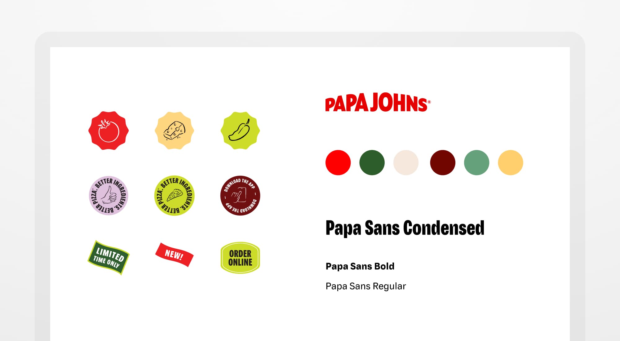
New brand guidelines, built in conjunction with an external agency
A New Homepage with More Offerings
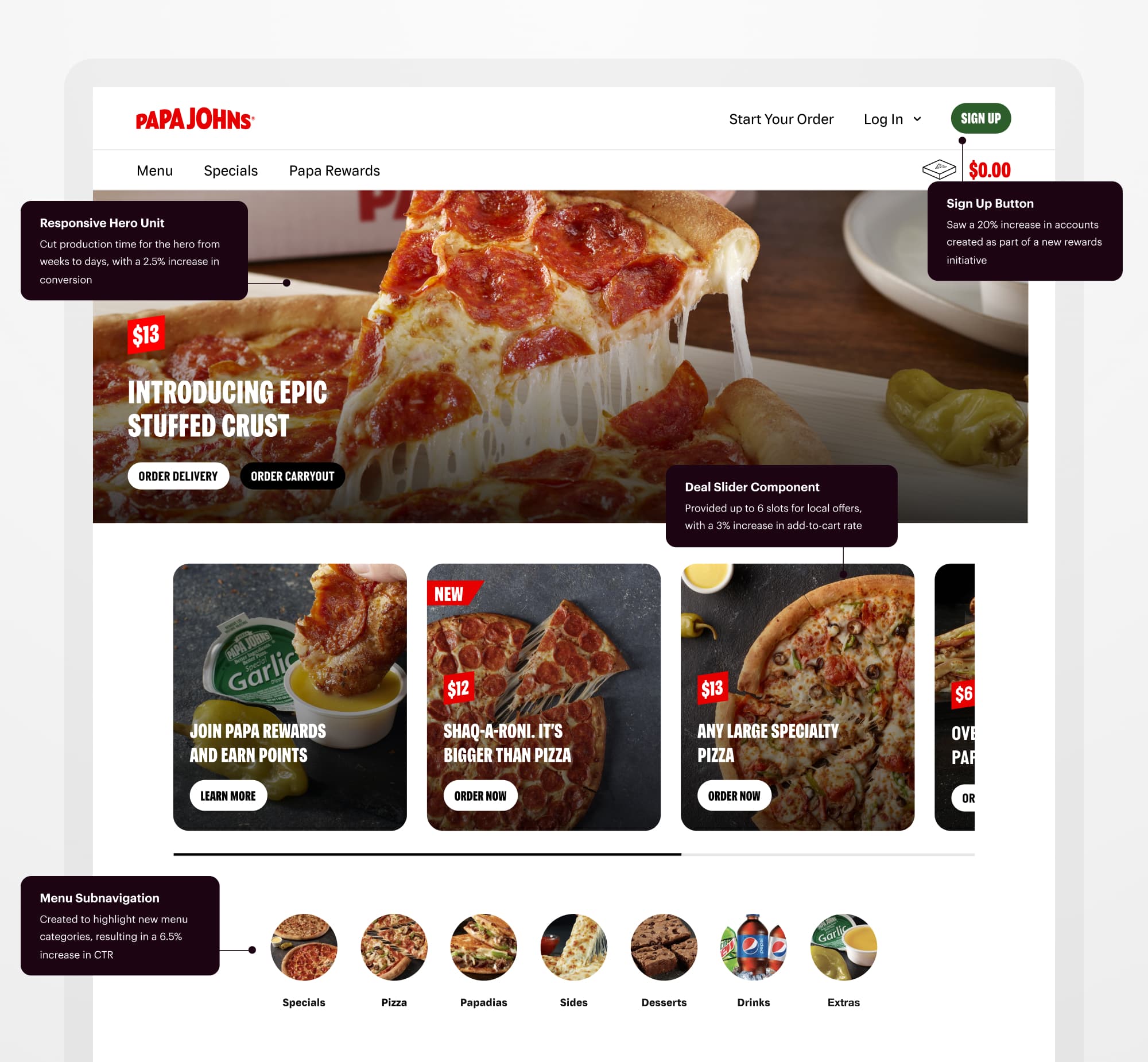
With a design system in place, I led two major redesigns of the Papa John’s homepage. In the navigation, I changed the dated red stripe to a more modern white header and exposed the “Sign Up” button as part of our new Papa Rewards initiative, which saw a 20% increase in accounts created.
For the homepage hero, the biggest challenge was moving the brand team away from creating banner images in Photoshop. We were loading seven different image sizes and not meeting accessibility standards. I introduced a full-size banner with selectable text and cut production time from weeks to days. Moving to the new design also saw a 2.5% increase in conversion.
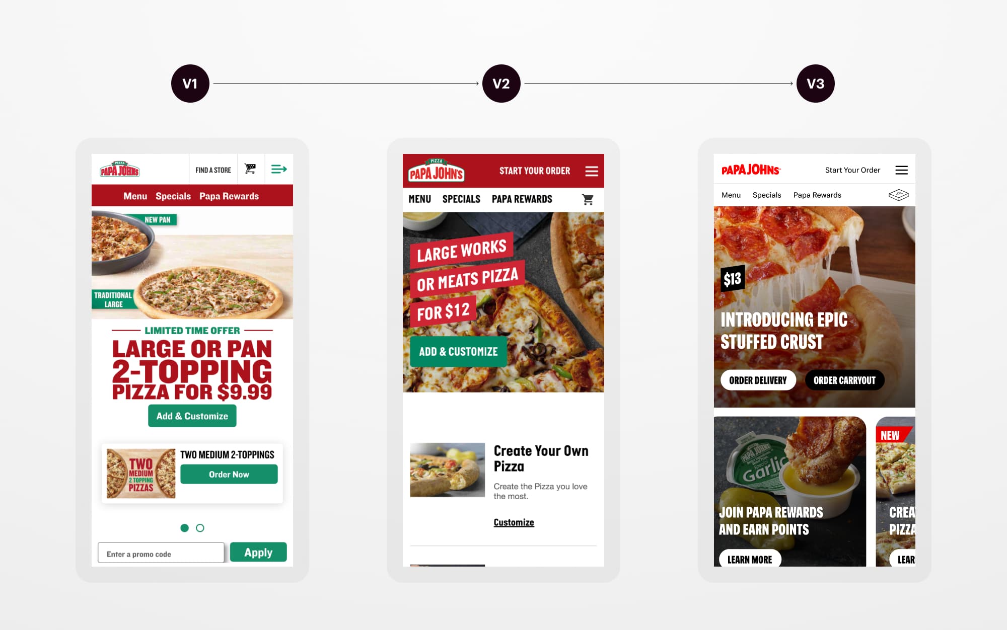
The progression of the Papa John’s homepage over the years
Previously, only two slots were available on the homepage for national and local deals, and franchise owners requested more options. I introduced a horizontal deal slider with up to 6 slots that saw a 3% increase in add-to-cart rate. We also didn’t see a significant drop in CTR from the first to the last slot.
I was curious if reducing the amount of body copy in the offer cards would affect conversion. Removing all body copy and only showing headlines resulted in an 8.6% increase in CTR and a more digestible experience for the user.
The most recent version of the Papa John’s homepage
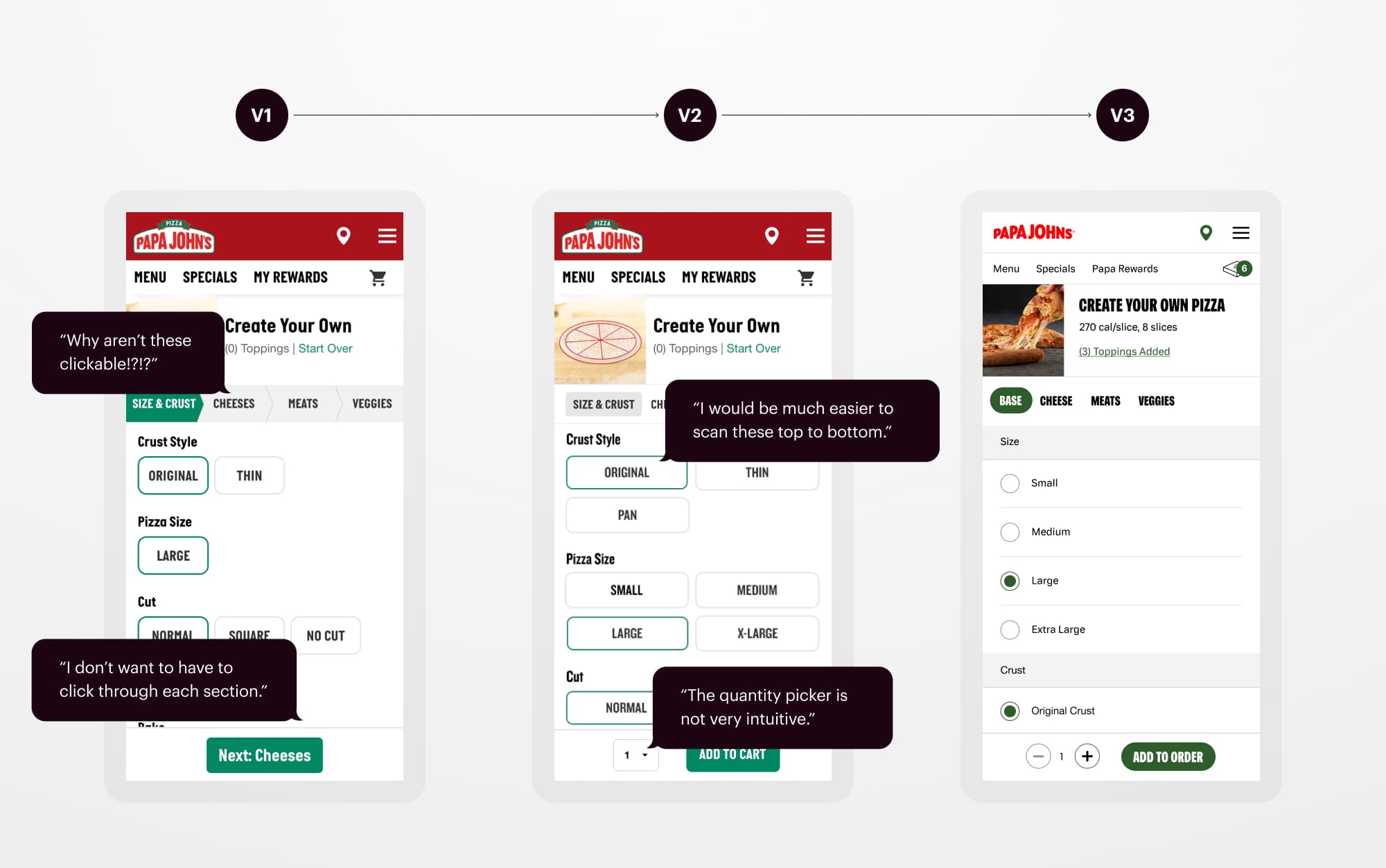
A Reimagined, Scalable Product Builder
Menu innovations came with new leadership in 2019, and I created a more versatile builder that could handle a variety of new products. By creating a mix-and-match set of topping and menu components, I worked with the engineering team to launch six new products in 2020. Papa Johns saw its highest growth of all time that year, with 23.8% same-store sales growth in Q3 alone.
Read more about our menu innovation journey at QSR Magazine.
The progression of the builder from 2018 - 2021
From late 2020 to 2021, we also launched four new specialty crusts. I tested several new ways to feature new crusts in the builder, including a lightbox on mobile devices. For the Epic Stuffed Crust launch, the lightbox had a 20% click-thru rate, increased revenue and conversion, and a 3% increase in average order value.
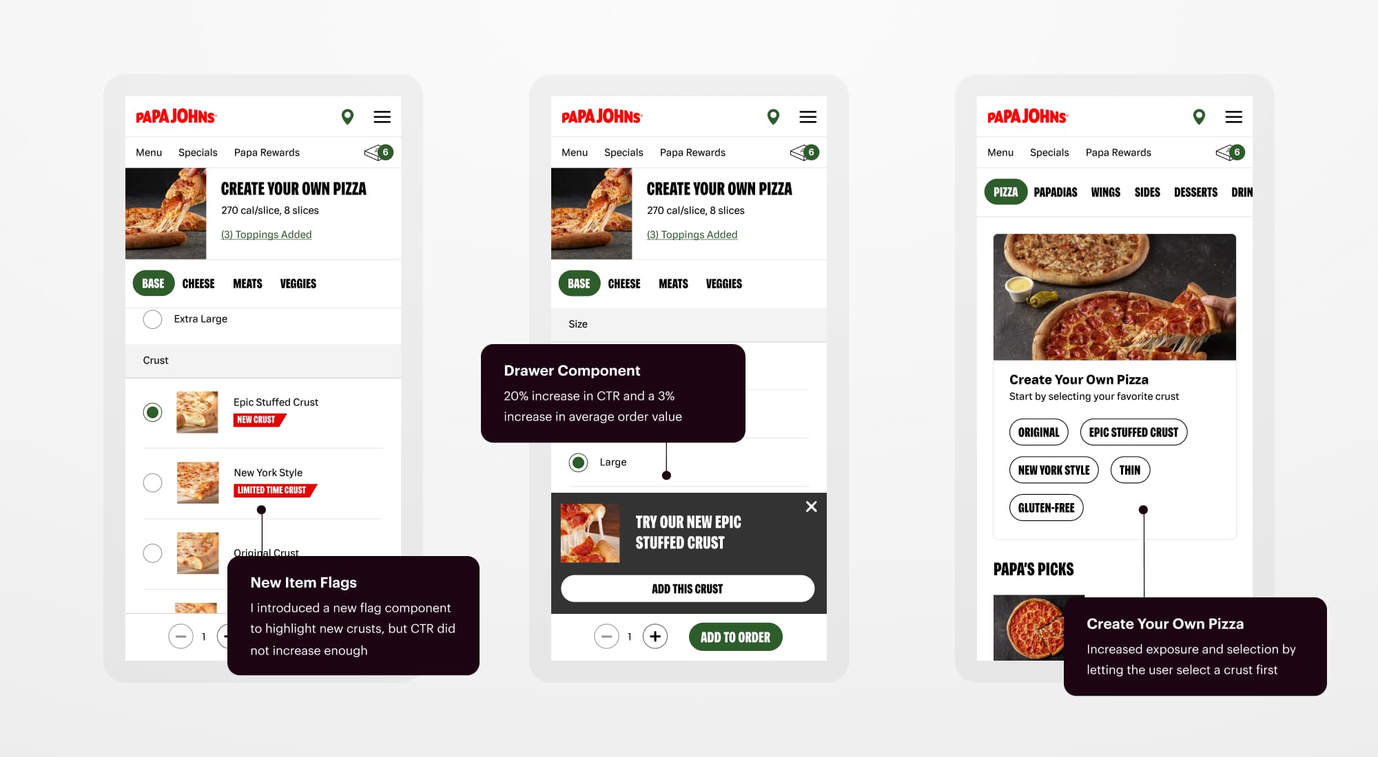
Designing and testing ways to feature new crusts
Identifying Pain Points
Historically, the store selection process had been the most significant dropoff point in Papa John’s ordering funnel. To order any item on the site, a user has to select a delivery or carryout method and find a local store.
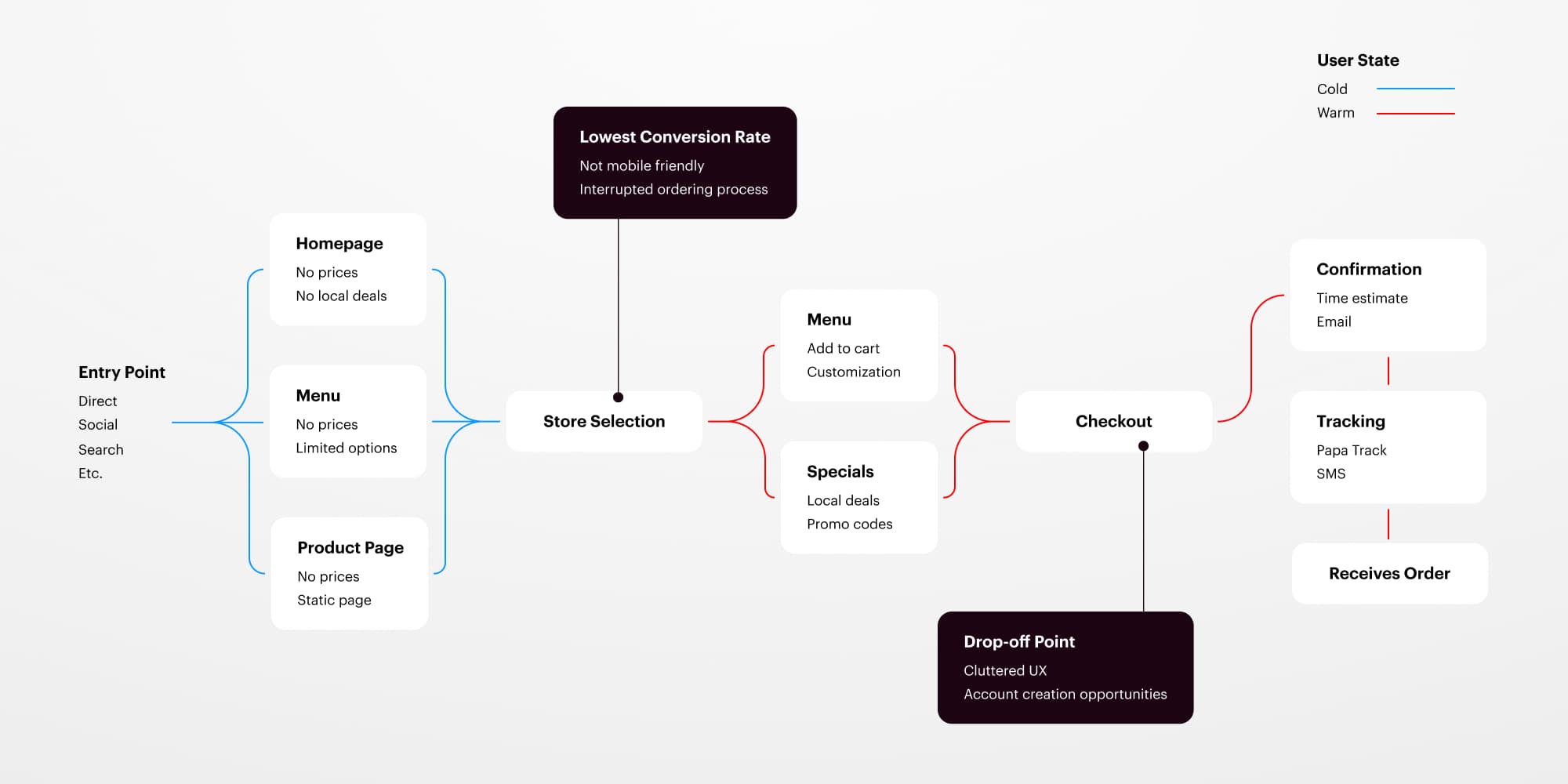
The ordering flow from start to finish
In its existing state, the carryout option wasn’t even visible on most devices, and I confirmed through testing that users felt like there were too many input fields to fill out. I pushed for a modern, single-input search with a mobile-friendly delivery/carryout toggle. Users could also see estimated wait times from this view and quickly load a saved address.
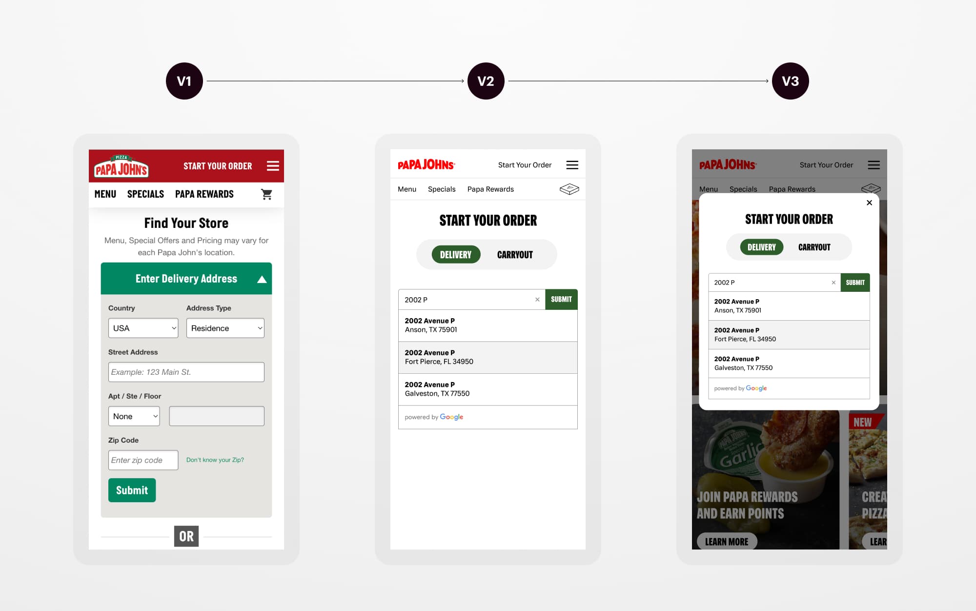
The progression of the Find Your Store experience
For carryout options, I moved from a static map to a fully interactive, draggable map. I also created more opportunities for stores to set their availability for curbside orders and store closings.
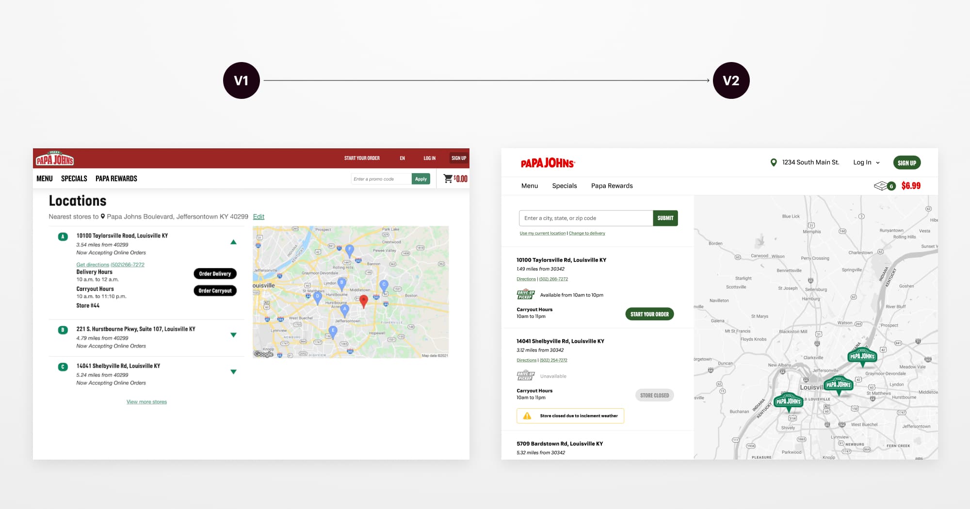
Before and after the new carryout experience
The checkout flow was also becoming a bottleneck as the product team added new features and payment methods. Previously, three different designers had worked on the checkout flow, but a new design had never shipped. I led a redesign introducing plan-ahead ordering, flexible papa dough, and three new payment methods. The new experience improved tipping interactions, increased conversion for signed-in users, and increased loyalty sign-ups by 118%.
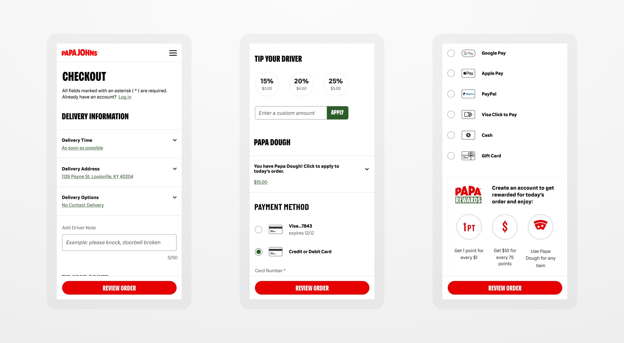
The updated checkout flow shows new delivery, payment, and loyalty interactions.
Building a Best-in-class Loyalty Program
I designed the end-to-end user experience for Papa John’s new loyalty program, which went from 12 to 20 million members in two years. At the time, only Starbucks, Panera Bread, and Domino’s had reached the 20 million mark. With loyalty members accounting for nearly half of our overall transactions, we could target customer segments with a new early-access menu. During checkout, I updated the UX and messaging, resulting in a 118% increase in sign-ups, and created a new way for users to apply Papa Dough currency to their orders.
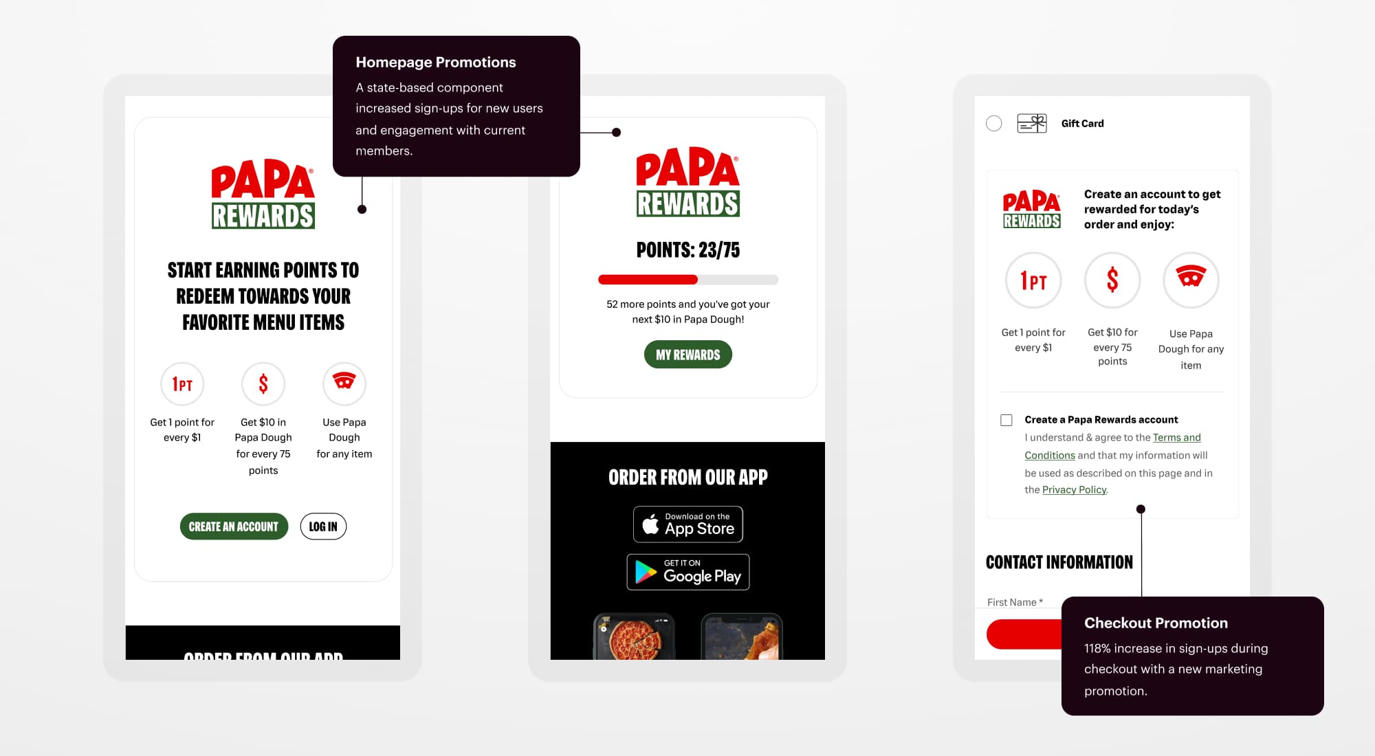
New marketing promos, including state-based homepage and checkout promotions
I designed the interactions for Papa Dough, part of the new loyalty initiative, so users could flexibly spend their rewards on any menu item. Papa John’s introduced a new early-access menu with the launch of the Shaq-a-roni XL Pizza, and I designed a new featured menu card to help it stand out on the menu and homepage. The early access menu was a smash hit, and we used it to promote every new menu item moving forward.
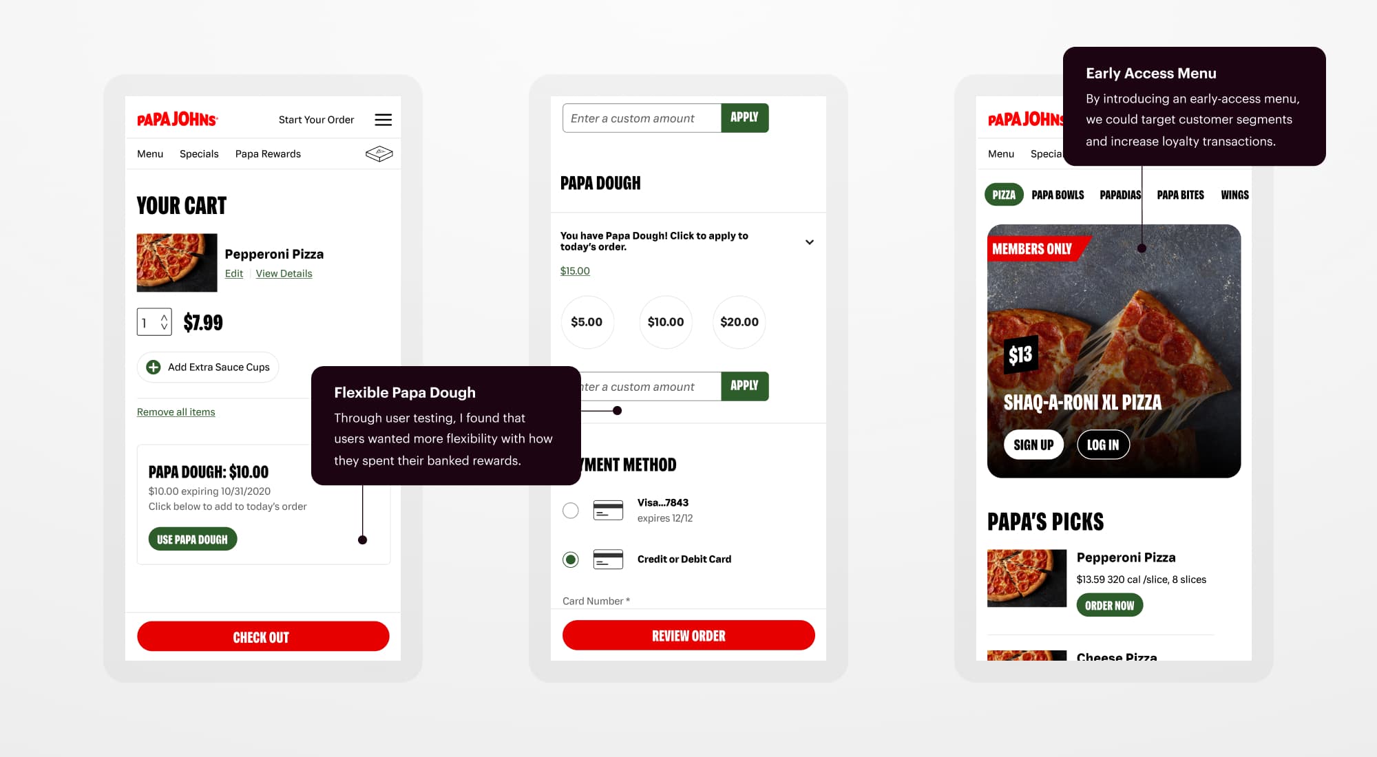
New Papa Dough interactions in the cart and checkout flow and a new early access menu.
Meeting the Challenges of COVID-19
COVID-19 changed the entire complexion of the restaurant business. While orders skyrocketed, we needed a way to keep delivery drivers and customers safe. My team designed, coded, and tested a no-contact delivery feature that went live in three weeks. Metrics showed that most customers preferred this option, and it became the default delivery method for over a year.
We also got creative with our delivery methods. I was part of the team that prototyped a drone delivery pilot program and launched a successful curbside service in under six weeks.
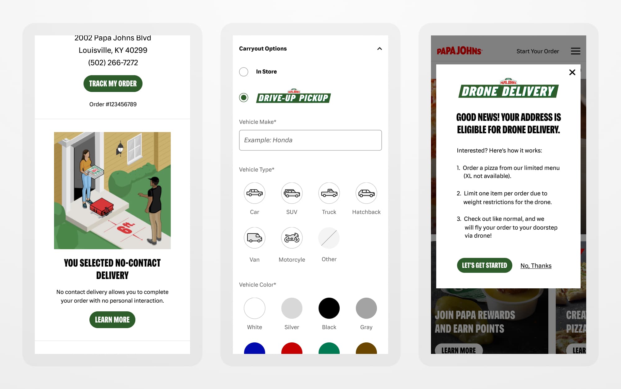
No-contact delivery, the new curbside experience, and a drone delivery prototype
After launching no-contact delivery, we received feedback from delivery drivers that pre-tipping was unpopular, and most drivers still relied on in-person tipping. Working alongside the architecture team, I created a post-tipping option and a series of pre-set tipping options that increased total tips by 9% and the overall tipping amount by 4%.
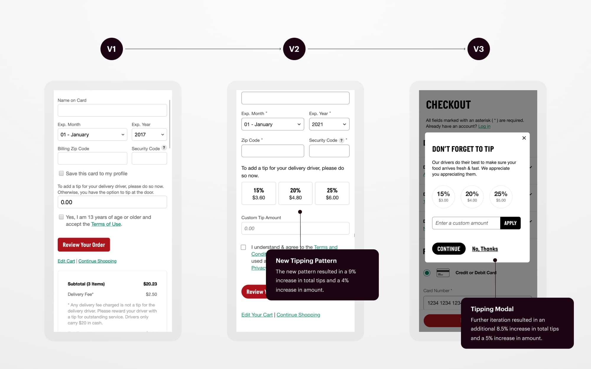
The progression of the tipping experience
Next Up